BP Portrait Award 2010, National Portrait Gallery | reviews, news & interviews
BP Portrait Award 2010, National Portrait Gallery
BP Portrait Award 2010, National Portrait Gallery
What are portraits for? You might find the answer right here
Thursday, 01 July 2010
Last month, the National Portrait Gallery unveiled a huge, new portrait of Anna Wintour. Painted by Alex Katz, the celebrated New York Pop portraitist, American Vogue’s scary editor-in-chief is shown with famous helmet bob intact, but minus her trademark dark glasses. The picture depicts Wintour, whose icy blue stare could run a chill through you (she's known as Nuclear Wintour), against a sunny yellow backdrop – which looks like an attempt to raise the temperature of that icicle glare. You pass it as you enter this year’s BP Portrait Award.
I’m thinking of that picture because, in its Alex Katz blandness, it raises all sorts of questions about portraiture: what it’s for and for whom. Following her appearance in the behind-the-scenes documentary The September Issue, perhaps Wintour wanted another stab at showing “the real me” (the catalogue essay by novelist Rose Tremain suggests one definition of the portraitist’s prime aspiration on which we may all agree: “to record without words the internal life of the individual"). Or perhaps it was just another stab at self-promotion, which is that other point of portraiture. Or maybe the sitting had less to do with Wintour than with Katz. Did he always long to paint that hard, inscrutable face? Was it a challenge, to get behind that perfectly made up veneer and to soften it a little?
 Except that – and here’s the thing – under that sturdy cap of spray-fixed hair the portrait really looks nothing like her at all (though it definitely looks like a Katz). The features. That nose. They don’t belong to her. The shape of the face isn’t even right. When you read the caption you might be prompted to say: “You could have stuck that red bob on anyone.” (Wintour’s bob, one feels, is a bit like Hitler’s moustache.)
Julian Opie, whose portraits of the four band members of Blur hang nearby, has, with just a few graphic marks, achieved a much better likeness of his “sitters”. In fact, they all look unmistakably as they look in real life, or at least as they looked at the height of their fame. But as cartoons.
So is Katz’s portrait just a bad painting? Or is it a bad portrait? Just what is a bad portrait? And if we don’t ever get to see the sitter with our own eyes, how can we judge whether it’s a good portrait – or at least a good likeness? (Is it really about physical likeness anyway?) Is the portrait about the sitter – about “the real me”– or the painter – a display of the artist’s virtuoso painterly skills and the exciting and innovative ways that an arguably staid genre can be revived? And are the two – the sitter and the painter, the portrait and the painting – in any kind of conflict?
 Given all this, just how are we to judge a portrait competition? We don’t usually know what any of the sitters for the BP Portrait Award actually look like – and historically this is true of most portraits; much less anything about their internal lives. Meanwhile, all around you at the NPG, you have some fairly indifferent paintings: these portraits aren’t about who painted them but who’s in them.
And finally, given that this is an open competition, with amateurs and professionals alike getting equal billing, should we even judge it as contemporary art, rather than as some little niche thing, out there on its own?
Amid the snipes and sneers that the BP Portrait Award regularly excites among critics, these are the questions that niggle me. The predominance of photorealism seems to get them, as it has, in the past, got to me (hey, why not take a photo instead?) Year on year, these portraits seem resolutely not to take note of fashion – not just fly-by-night fads, but slightly deeper cultural shifts, too (though one often does note certain trends). They are both outside fashion and out of fashion. But every year the award seems to grow in popularity: almost without fail the press office reports “record submissions”, and the footfall at the exhibition can sometimes make it hard to get a proper view.
I enjoyed the Portrait Award a lot this year, without, in fact, actively warming to many of the shortlisted entries. The standard is exceptionally high. One is impressed by the meticulous craftsmanship and skill. And a good portrait painting speaks to us uniquely: we project on to it. And so when you come across one that does this for you, you treasure the experience.
 There were only a few I actively disliked. Early on, I creased my nose at The ‘Finger-Assisted’ Nephrectomy of Professor Nadey Hakim (I won’t quote in full the exceptionally long title) by Henry Ward. A group portrait of elegantly suited eminent surgeons standing over an anaesthetised patient, it makes reference to Rembrandt’s The Anatomy Lesson of Dr Tulp, but in a style that closely resembles those harsh, Art Deco paintings of the fast set by Tamara de Lempicka. And there were a lot that I was simply indifferent to. But sometimes even very good paintings do nothing at all for the viewer. One is either engaged or one isn’t.
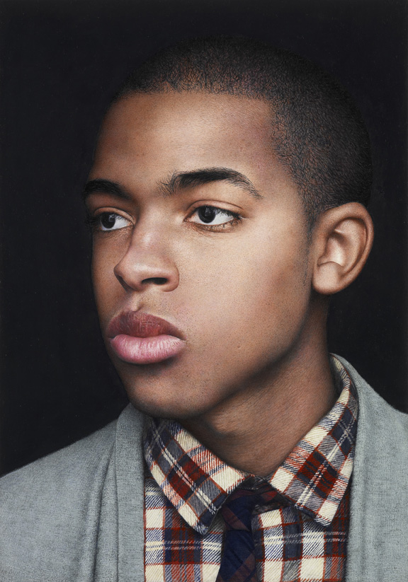
I couldn’t get terribly excited by either the winner or the two runners-up, although the two runners-up, were, in that exceptionally immaculate photorealist fashion, impressive. Both Michael Gaskell’s Harry (second prize; pictured above left) and David Eichenberg’s Tim II (third prize; pictured top right) are paintings that demonstrate considerable virtuoso skill. What is it then? Perhaps they are just too immaculately finished? So photo-like, especially Eichenberg’s, that the artist himself eludes you, and there’s none of that lively three-way conversation between viewer, subject and painter.
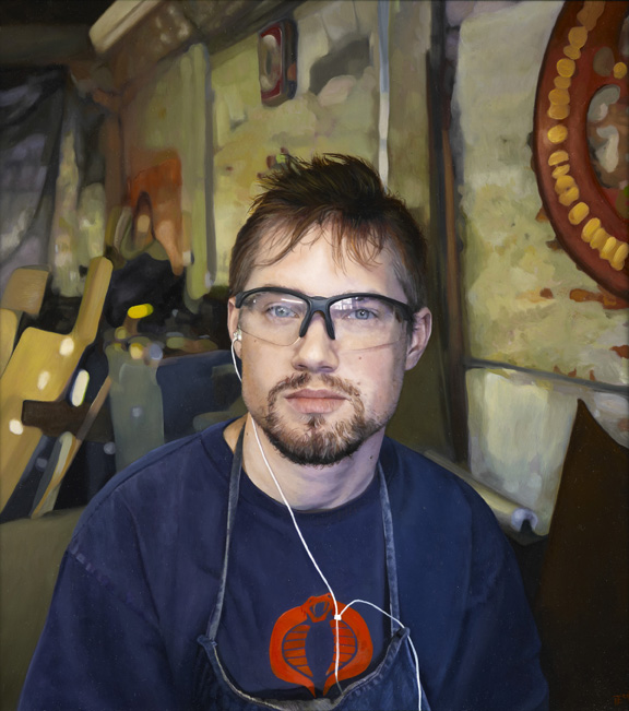
But I liked the winner of the Young Artist Award (an 18 to 30 category): Elizabeth McDonald for Don’t be Too Serious (pictured above right). It reminded me a little of an early David Hockney, though maybe that connection has more to do with the boy in the picture wearing heavy-rimmed glasses. At any rate, the artist has certainly captured something of the eager but nonchalant air of someone who is either in their late teens or early twenties.
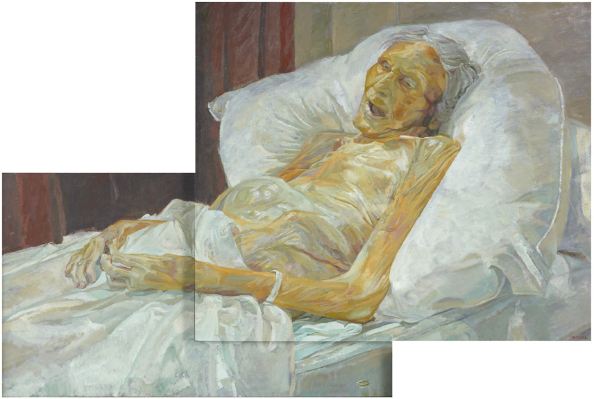 The winning portrait, Last Portrait of Mother (pictured right) by Daphne Todd is not a life study but a death portrait. Painted in the cooled room of a funeral parlour, Todd’s recently deceased 100-year-old mother lies propped up in bed, gummy mouth agape. The sheet is turned down to reveal a shockingly emaciated body (we learn in interviews given by Todd that her mother refused food before she died). With her slightly oversized head, her skin like shrunken paper stretched over a fragile armature and arms that, in their thinness, appear too long, she looks almost puppet-like; like one of those macabre puppets you sometimes see in the window of a toy shop (which sounds terrible, written down).
Todd’s painting is referred to as a “devotional study”, and perhaps the religious reference means to distance us from the rawness of death and the individuality of the subject. Death portraits can often speak movingly to us, but not here. The distance here seems too great.
 There are two portraits that won me over instantly. The first is Thea Penna’s Lila Pearl (main picture), which portrays the artist’s two-year-old daughter as she retreats into a corner. Boxed in by a huge wooden chest, she appears at once achingly vulnerable and completely self-contained. Exuding the wariness and defiance of the young child, the gaze remains utterly fixed. It’s a disarming and entirely empathetic portrait. Getting under the skin of your subject is what makes a winning portrait – even if you don’t get to take home prizes.
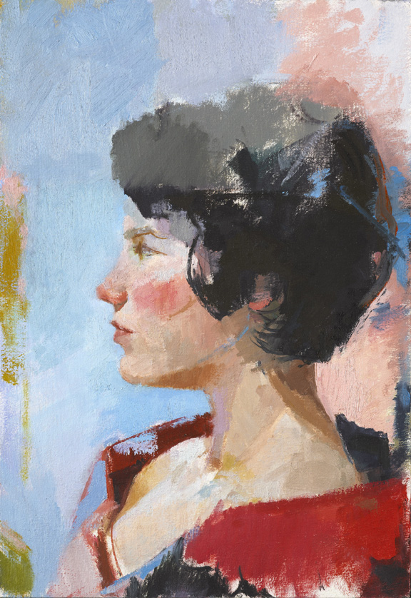
The second portrait I liked for more formal reasons and because I loved the colours and the fluid palette (it also has a kind of cool Fifties, Italian vibe). Ilaria Rosselli Del Turco’s Geneva (pictured left), a small profile portrait of a young woman with striking black hair is painted in rich, blushing colours, and though its size makes it easy to overlook, everything about it is seductive.
A personal hit rate of three may not sound entirely persuasive, but I doubt this will dampen anyone's enthusiasm for this popular award. Go, and you’ll be stimulated at the very least.
Except that – and here’s the thing – under that sturdy cap of spray-fixed hair the portrait really looks nothing like her at all (though it definitely looks like a Katz). The features. That nose. They don’t belong to her. The shape of the face isn’t even right. When you read the caption you might be prompted to say: “You could have stuck that red bob on anyone.” (Wintour’s bob, one feels, is a bit like Hitler’s moustache.)Julian Opie, whose portraits of the four band members of Blur hang nearby, has, with just a few graphic marks, achieved a much better likeness of his “sitters”. In fact, they all look unmistakably as they look in real life, or at least as they looked at the height of their fame. But as cartoons.
So is Katz’s portrait just a bad painting? Or is it a bad portrait? Just what is a bad portrait? And if we don’t ever get to see the sitter with our own eyes, how can we judge whether it’s a good portrait – or at least a good likeness? (Is it really about physical likeness anyway?) Is the portrait about the sitter – about “the real me”– or the painter – a display of the artist’s virtuoso painterly skills and the exciting and innovative ways that an arguably staid genre can be revived? And are the two – the sitter and the painter, the portrait and the painting – in any kind of conflict?
Given all this, just how are we to judge a portrait competition? We don’t usually know what any of the sitters for the BP Portrait Award actually look like – and historically this is true of most portraits; much less anything about their internal lives. Meanwhile, all around you at the NPG, you have some fairly indifferent paintings: these portraits aren’t about who painted them but who’s in them.And finally, given that this is an open competition, with amateurs and professionals alike getting equal billing, should we even judge it as contemporary art, rather than as some little niche thing, out there on its own?
Amid the snipes and sneers that the BP Portrait Award regularly excites among critics, these are the questions that niggle me. The predominance of photorealism seems to get them, as it has, in the past, got to me (hey, why not take a photo instead?) Year on year, these portraits seem resolutely not to take note of fashion – not just fly-by-night fads, but slightly deeper cultural shifts, too (though one often does note certain trends). They are both outside fashion and out of fashion. But every year the award seems to grow in popularity: almost without fail the press office reports “record submissions”, and the footfall at the exhibition can sometimes make it hard to get a proper view.
I enjoyed the Portrait Award a lot this year, without, in fact, actively warming to many of the shortlisted entries. The standard is exceptionally high. One is impressed by the meticulous craftsmanship and skill. And a good portrait painting speaks to us uniquely: we project on to it. And so when you come across one that does this for you, you treasure the experience.
There were only a few I actively disliked. Early on, I creased my nose at The ‘Finger-Assisted’ Nephrectomy of Professor Nadey Hakim (I won’t quote in full the exceptionally long title) by Henry Ward. A group portrait of elegantly suited eminent surgeons standing over an anaesthetised patient, it makes reference to Rembrandt’s The Anatomy Lesson of Dr Tulp, but in a style that closely resembles those harsh, Art Deco paintings of the fast set by Tamara de Lempicka. And there were a lot that I was simply indifferent to. But sometimes even very good paintings do nothing at all for the viewer. One is either engaged or one isn’t.I couldn’t get terribly excited by either the winner or the two runners-up, although the two runners-up, were, in that exceptionally immaculate photorealist fashion, impressive. Both Michael Gaskell’s Harry (second prize; pictured above left) and David Eichenberg’s Tim II (third prize; pictured top right) are paintings that demonstrate considerable virtuoso skill. What is it then? Perhaps they are just too immaculately finished? So photo-like, especially Eichenberg’s, that the artist himself eludes you, and there’s none of that lively three-way conversation between viewer, subject and painter.
But I liked the winner of the Young Artist Award (an 18 to 30 category): Elizabeth McDonald for Don’t be Too Serious (pictured above right). It reminded me a little of an early David Hockney, though maybe that connection has more to do with the boy in the picture wearing heavy-rimmed glasses. At any rate, the artist has certainly captured something of the eager but nonchalant air of someone who is either in their late teens or early twenties.
The winning portrait, Last Portrait of Mother (pictured right) by Daphne Todd is not a life study but a death portrait. Painted in the cooled room of a funeral parlour, Todd’s recently deceased 100-year-old mother lies propped up in bed, gummy mouth agape. The sheet is turned down to reveal a shockingly emaciated body (we learn in interviews given by Todd that her mother refused food before she died). With her slightly oversized head, her skin like shrunken paper stretched over a fragile armature and arms that, in their thinness, appear too long, she looks almost puppet-like; like one of those macabre puppets you sometimes see in the window of a toy shop (which sounds terrible, written down).Todd’s painting is referred to as a “devotional study”, and perhaps the religious reference means to distance us from the rawness of death and the individuality of the subject. Death portraits can often speak movingly to us, but not here. The distance here seems too great.
There are two portraits that won me over instantly. The first is Thea Penna’s Lila Pearl (main picture), which portrays the artist’s two-year-old daughter as she retreats into a corner. Boxed in by a huge wooden chest, she appears at once achingly vulnerable and completely self-contained. Exuding the wariness and defiance of the young child, the gaze remains utterly fixed. It’s a disarming and entirely empathetic portrait. Getting under the skin of your subject is what makes a winning portrait – even if you don’t get to take home prizes.The second portrait I liked for more formal reasons and because I loved the colours and the fluid palette (it also has a kind of cool Fifties, Italian vibe). Ilaria Rosselli Del Turco’s Geneva (pictured left), a small profile portrait of a young woman with striking black hair is painted in rich, blushing colours, and though its size makes it easy to overlook, everything about it is seductive.
A personal hit rate of three may not sound entirely persuasive, but I doubt this will dampen anyone's enthusiasm for this popular award. Go, and you’ll be stimulated at the very least.
- BP Portrait Award 2010 at the National Portrait Gallery in London until 19 September
Add comment
more Visual arts
 Stephen review - a breathtakingly good first feature by a multi-media artist
Melanie Manchot's debut is strikingly intelligent and compelling
Stephen review - a breathtakingly good first feature by a multi-media artist
Melanie Manchot's debut is strikingly intelligent and compelling
 Fantastic Machine review - photography's story from one camera to 45 billion
Love it or hate it, the photographic image has ensnared us all
Fantastic Machine review - photography's story from one camera to 45 billion
Love it or hate it, the photographic image has ensnared us all
 Yinka Shonibare: Suspended States, Serpentine Gallery review - pure delight
Weighty subject matter treated with the lightest of touch
Yinka Shonibare: Suspended States, Serpentine Gallery review - pure delight
Weighty subject matter treated with the lightest of touch
'; 'Consigliere'; 'Devil's Advocate (diptyque)', 2014-2018") Jane Harris: Ellipse, Frac Nouvelle-Aquitaine MÉCA, Bordeaux review - ovals to the fore
Persistence and conviction in the works of the late English painter
Jane Harris: Ellipse, Frac Nouvelle-Aquitaine MÉCA, Bordeaux review - ovals to the fore
Persistence and conviction in the works of the late English painter
 Sargent and Fashion, Tate Britain review - portraiture as a performance
London’s elite posing dressed up to the nines
Sargent and Fashion, Tate Britain review - portraiture as a performance
London’s elite posing dressed up to the nines
 Zineb Sedira: Dreams Have No Titles, Whitechapel Gallery review - a disorientating mix of fact and fiction
An exhibition that begs the question 'What and where is home?'
Zineb Sedira: Dreams Have No Titles, Whitechapel Gallery review - a disorientating mix of fact and fiction
An exhibition that begs the question 'What and where is home?'
 Yoko Ono: Music of the Mind, Tate Modern review - a fitting celebration of the early years
Acknowledgement as a major avant garde artist comes at 90
Yoko Ono: Music of the Mind, Tate Modern review - a fitting celebration of the early years
Acknowledgement as a major avant garde artist comes at 90
 Unravel: The Power and Politics of Textiles in Art, Barbican review - the fabric of dissent
An ambitious exploration of a neglected medium
Unravel: The Power and Politics of Textiles in Art, Barbican review - the fabric of dissent
An ambitious exploration of a neglected medium
 by Studio DRIFT, Michel Blazy and Olaf Brzeski, When Forms Come Alive and Bouquet Final (2012 by Michel Blazy") When Forms Come Alive, Hayward Gallery review - how to reduce good art to family fun
Seriously good sculptures presented as little more than playthings or jokes
When Forms Come Alive, Hayward Gallery review - how to reduce good art to family fun
Seriously good sculptures presented as little more than playthings or jokes
 Entangled Pasts 1768-now, Royal Academy review - an institution exploring its racist past
After a long, slow journey from invisibility to agency, black people finally get a look in
Entangled Pasts 1768-now, Royal Academy review - an institution exploring its racist past
After a long, slow journey from invisibility to agency, black people finally get a look in
', 2020, by Barbara Kruger") Barbara Kruger, Serpentine Gallery review - clever, funny and chilling installations
Exploring the lies, deceptions and hyperbole used to cajole, bully and manipulate us
Barbara Kruger, Serpentine Gallery review - clever, funny and chilling installations
Exploring the lies, deceptions and hyperbole used to cajole, bully and manipulate us
 Richard Dorment: Warhol After Warhol review - beyond criticism
A venerable art critic reflects on the darkest hearts of our aesthetic market
Richard Dorment: Warhol After Warhol review - beyond criticism
A venerable art critic reflects on the darkest hearts of our aesthetic market
Comments
...
...