Jean-Marc Bustamante, Timothy Taylor Gallery | reviews, news & interviews
Jean-Marc Bustamante, Timothy Taylor Gallery
Jean-Marc Bustamante, Timothy Taylor Gallery
Is cheeriness enough to make art?
Wednesday, 20 April 2011
Who or what is Jean-Marc Bustamante? This, surely, is the question we are supposed to ask of this artist of the affectless, who has skated in his three-decade-long career across the genres – first photography, then Minimalist sculpture, then a merger of the two, and for the last few years these shockingly vivid “paintings” (I use the scare quotes intentionally) on Plexiglass.
In the late 1970s and the 1980s, Bustamante (b 1952) made his name with a long-running photographic cycle of C-prints, including the overarching Tableaux (Pictures). These were images taken on the margins, generally where urban meets rural: an unpeopled, failed suburbia of abandoned construction and empty roads. It seemed he was photographing a negative, a not-being.
 In the 1980s he moved on to sculpture, focusing often on flatness, on the two-dimensionality of this three-dimensional art. His lovely Stationnaire II was a dozen boxes which held photographs of cypress trees, the trees photographed close-up and bursting the borders of the paper they were printed on, a 3D/2D, interior/exterior exploration.
Now, with these paintings, he seems to be linking the anonymity of his early photographs in their deadpan, flat style. It is hard to know what to make of them. Starting with inks and a brush, Bustamante produces small drawings (or perhaps since they are done by brush, one should call them ink-colours, instead of watercolours), which are then scanned and reproduced by computer using a screen-print process on large (150 cm x 150 cm) Plexiglass sheets.
Thus the personality of the artist is carefully removed twice – on the computer, when the hand-drawn images are simplified, and then in the industrial production process when all sense of brushstroke, artist’s hand or personality are effaced.
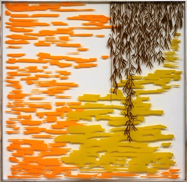 What is left frequently has a Pop-ish cheerfulness. Cardinal (main picture, above) uses a thin traced line to create a background depth, which is then shadowed on the white wall on which the Plexiglass hangs. A pleasant gestural line creates the memory of a bird once seen, in a Japanese-y flowing fall of colour. Landau (pictured right), too, uses its colour range in an interesting tonal development, moving from orange to yellow-green to olive.
But several other pictures fail to cohere at all, reducing simplicity well past simple to feebleness, perhaps losing their sense of purpose from the shift in scale from drawing to computer. And it's a sense of purpose that is most lacking here. The images are slick, they are frequently enjoyable, it is hard to be offended by them. Some of them make you smile. But I daresay Monsieur Bustamante feels his art has more purpose than that. It’s just hard to find it in these acrylic homages to Warholian absence.
The title of the show is Take Something Hot and Cool it Down, referring to the artist’s drawing as the “hot” element, the cooling coming from computer intervention. They are, certainly, cooled down. I don’t think, though, in the Warholian sense, they are cool.
- Jean-Marc Bustamante at the Timothy Taylor Gallery, London W1, to 21 May
 Find books on Jean-Marc Bustamante on Amazon
Share this article
more Visual arts
 Stephen review - a breathtakingly good first feature by a multi-media artist
Melanie Manchot's debut is strikingly intelligent and compelling
Stephen review - a breathtakingly good first feature by a multi-media artist
Melanie Manchot's debut is strikingly intelligent and compelling
 Fantastic Machine review - photography's story from one camera to 45 billion
Love it or hate it, the photographic image has ensnared us all
Fantastic Machine review - photography's story from one camera to 45 billion
Love it or hate it, the photographic image has ensnared us all
 Yinka Shonibare: Suspended States, Serpentine Gallery review - pure delight
Weighty subject matter treated with the lightest of touch
Yinka Shonibare: Suspended States, Serpentine Gallery review - pure delight
Weighty subject matter treated with the lightest of touch
'; 'Consigliere'; 'Devil's Advocate (diptyque)', 2014-2018") Jane Harris: Ellipse, Frac Nouvelle-Aquitaine MÉCA, Bordeaux review - ovals to the fore
Persistence and conviction in the works of the late English painter
Jane Harris: Ellipse, Frac Nouvelle-Aquitaine MÉCA, Bordeaux review - ovals to the fore
Persistence and conviction in the works of the late English painter
 Sargent and Fashion, Tate Britain review - portraiture as a performance
London’s elite posing dressed up to the nines
Sargent and Fashion, Tate Britain review - portraiture as a performance
London’s elite posing dressed up to the nines
 Zineb Sedira: Dreams Have No Titles, Whitechapel Gallery review - a disorientating mix of fact and fiction
An exhibition that begs the question 'What and where is home?'
Zineb Sedira: Dreams Have No Titles, Whitechapel Gallery review - a disorientating mix of fact and fiction
An exhibition that begs the question 'What and where is home?'
 Yoko Ono: Music of the Mind, Tate Modern review - a fitting celebration of the early years
Acknowledgement as a major avant garde artist comes at 90
Yoko Ono: Music of the Mind, Tate Modern review - a fitting celebration of the early years
Acknowledgement as a major avant garde artist comes at 90
 Unravel: The Power and Politics of Textiles in Art, Barbican review - the fabric of dissent
An ambitious exploration of a neglected medium
Unravel: The Power and Politics of Textiles in Art, Barbican review - the fabric of dissent
An ambitious exploration of a neglected medium
 by Studio DRIFT, Michel Blazy and Olaf Brzeski, When Forms Come Alive and Bouquet Final (2012 by Michel Blazy") When Forms Come Alive, Hayward Gallery review - how to reduce good art to family fun
Seriously good sculptures presented as little more than playthings or jokes
When Forms Come Alive, Hayward Gallery review - how to reduce good art to family fun
Seriously good sculptures presented as little more than playthings or jokes
 Entangled Pasts 1768-now, Royal Academy review - an institution exploring its racist past
After a long, slow journey from invisibility to agency, black people finally get a look in
Entangled Pasts 1768-now, Royal Academy review - an institution exploring its racist past
After a long, slow journey from invisibility to agency, black people finally get a look in
', 2020, by Barbara Kruger") Barbara Kruger, Serpentine Gallery review - clever, funny and chilling installations
Exploring the lies, deceptions and hyperbole used to cajole, bully and manipulate us
Barbara Kruger, Serpentine Gallery review - clever, funny and chilling installations
Exploring the lies, deceptions and hyperbole used to cajole, bully and manipulate us
 Richard Dorment: Warhol After Warhol review - beyond criticism
A venerable art critic reflects on the darkest hearts of our aesthetic market
Richard Dorment: Warhol After Warhol review - beyond criticism
A venerable art critic reflects on the darkest hearts of our aesthetic market
Add comment