Who gives a **** about Henry Moore? The standing of the craggy-faced Yorkshire miner’s son who dominated British art for half a century has declined massively since his death in 1986. Where once Moore was British art, most people in this country have now probably never heard of him. Those pin-headed, slab-like forms that once seemed universal in their embodiment of utopian modernity now feel so of their time you expect to see Muffin the Mule come clopping round the corner at any moment.
If the watchword of contemporary culture has become "difference" – the compunction to accommodate the "other view" to a point where there is no middle ground – Moore is the very antithesis of that notion: a stolid alpha male who strove for centrality and wholeness. With his monumental semi-abstract forms sprouting beside official buildings, his family groups standing in comprehensive school car parks, Moore created the official art of the post-war consensus. And if you don’t feel nostalgia for that now distant period (and even if you do) it’s difficult to justify Moore to the non-specialist in terms that don’t feel worthy, even downright boring.
Yet is Moore so stolid – so irrecuperably worthy? Aren’t such perceptions simply a lazy and essentially philistine overreaction to the inordinate fame and success Moore enjoyed in his lifetime? Tate’s major retrospective attempts to rediscover Moore for a new time – and it’s nearly a quarter of a century since his death – by looking back beyond the endless commissions and honours of the latter years, to discover a darker, edgier, sexier artist in the interwar period, when Moore was still a contentious, avant-garde figure.
The objects in the first room, assembled under the title "World Cultures" (whatever the hell that means; and I say that as a sometime writer on "world music"), have a period quaintness. Anyone who saw the Royal Academy’s Wild Thing – Epstein, Gaudier-Brzeska, Gill last year and felt the sense of a gauche, provincial, slightly lumpen response to developments in Paris will know exactly where they are here. Moore was far from being alone in looking at so-called "primitive art" during the 1920s – it was, in fact, intensely fashionable - and his early reactions to the sculpture of Africa, Oceania and, above all, ancient Mexico feel filtered through the influence of those older artists, particularly Epstein, giving his early work a slightly second-hand and faintly risible Gauguin-goes-art deco look.
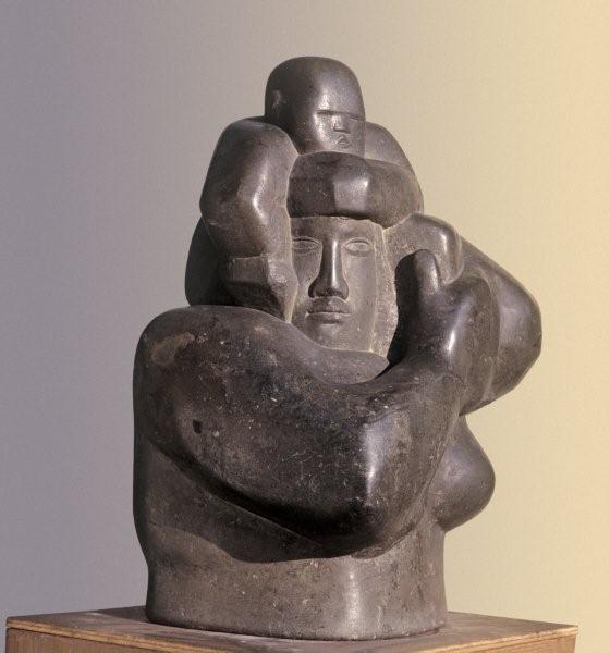 Yet from the first his sculpture has a marvellously sensual feel for materials, a luxuriant enjoyment of the grain, tactility and colour of different stones and marbles, of deep-hued woods and brutalised plaster that complements his slightly dour maleness. The cuboid form of Mother and Child of 1924-5 (pictured right, Manchester City Galleries), retains the sense of the block it was hewn from, the mother’s broad limbs wrapping themselves around the form, binding herself and the child into the gleaming, greenish grey Hornton stone, which is packed with tiny fossils. At the same time, the generalised, "exotic" cast of the features and the heroic monumentality of the pose bring to mind the kind of totalitarian, not-quite-modernist feel that prevailed in public sculpture throughout Europe between the wars. But is that Moore’s fault? Would you castigate Michelangelo for producing images that looked as though they belonged in a Renaissance building?
There’s a similarly architectonic feel to the first of the reclining figures, from 1929 (the first image in theartsdesk's Henry Moore gallery here), a kind of Mayan-deco beach babe with her arm behind her head, the grain in the yellowish grey stone magnificently deployed across her slab-like limbs. If she appears expressly designed to slot into the corner of some building, she also looks spectacular against the gallery's deep red walls.
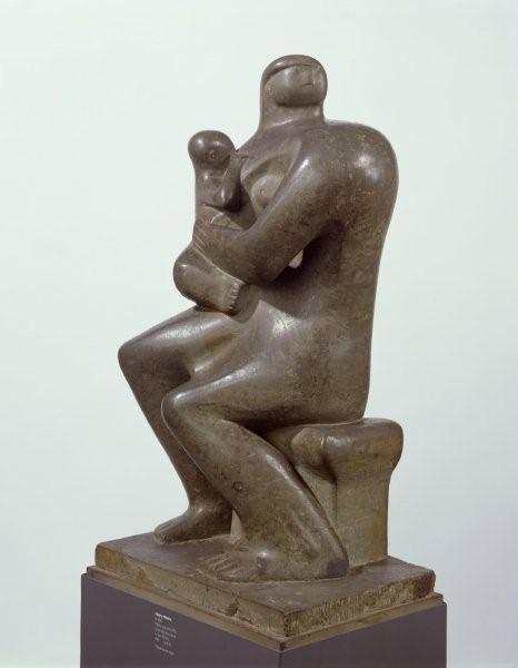 The twisting head of the massive Mother and Child of 1932 (pictured left, Sainsbury Collection) (and with so many exhibits called either Mother and Child or Reclining Figure this is bound to get confusing) nods to the urban dynamism of Cubism and Futurism, and from the early 1930s Moore took greater liberties with the human figure, bending and dismembering it under the influence of European Modernism.
A series of images in soft, red Corsehill stone, with an amorphous, almost ghostly feel redolent of Surrealism, show a less familiar aspect of Moore. But a number of objects emphasising space within form using a lacing of string feel somehow too close to home – too evocative of a genteel, Hampstead Modernism, of tennis with Ben Nicholson and Barbara Hepworth, whose work is often almost indistinguishable from Moore’s in this period. And if that reaction is to a degree crass – what does it matter where they were made? – there’s an inescapable sense that we need to get much further away from such objects to really assess their value.
Equally, the magnificently rounded Recumbent Form of 1938 (fifth image in our gallery), may be almost perfect in its balance of human and landscape forms, but it feels so much the prototype for a kind of utopian humanism that prevailed in the post-war period it’s difficult to appreciate its qualities afresh.
The twisting, agonised forms of a smaller bronze reclining figure from 1931 (third image in our gallery), appears to tap into into the dark, sado-masochistic vein that informs much of Picasso and Giacometti’s work during this period – reflecting the curator’s desire to link Moore to the more morbid side of surrealism and the then fashionable interest in psycho-analysis. This tortured quality is even more apparent in the jagged-edged Maquette for Mother and Child of 1952, in which the child appears about to eat the mother. Yet such images are untypical. The obvious influence here, as in much of Moore’s work, is Picasso. Yet the two artists are so different in spirit, it’s difficult to feel any really deep connection. If much of Picasso’s work is profoundly destructive in impulse, Moore’s monumentality is essentially traditional and affirmatory in spirit. If there’s a limitation to Moore’s vision it’s that, unlike Picasso's, it doesn’t contain enough contradictions.
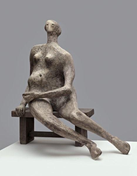 The huge plaster Reclining Figure of 1951 (eighth image in our gallery), in which the form is emphasised with a kind of drawing into the surface with inlaid string, feels already too official, too public in its equivalence of female form and a bony, chalky English downland landscape; feels too much like something created to show Britain a modernist view of itself in that era of the Festival of Britain. It’s by no means bad, but Picasso, you feel, would have got more into it. Seated Woman (pictured right, Tate) on the other hand – also in plaster, but here darkened and heavily scored – has a disconcerting lopsided physicality, a sense of the precariousness of being an animal erect on two feet (a quality sadly not apparent in the photograph).
Upright Internal/External Form, from 1952-3, an elemental human form enclosed by a kind of pod, which Moore realised in many scales and media, including an enormous bronze (from which he is said to have made more money than most sculptors make in a lifetime) demonstrates the dangers of endlessly extending an object beyond its original scale. We see it here in its original plaster form, and while it’s a worthy piece in its own terms, you can feel a creeping sense of the dullness and academicism that overtook some of his later sculpture.
The metaphor of the domed form of Atom Piece, 1964, made for the University of Chicago where the first first nuclear chain reaction was made, which echoes both a mushroom cloud and a skull seen on a CND poster, feels horribly overblown. The final room, though, gives us the very best of Moore, with four of his six monumental figures in elm wood. If this material is dead, inert, these four great recumbent pieces, ranging in period from the 1930s to 1970s, are imbued with such a sense of inner energy that the room seems to vibrate with a kind of reflected movement. The sensuality of those massive splayed thighs, enhanced by the sumptuous tactility of the polished yellow wood, is completely female, while the tension with which they’ve been hacked into being, with which they’ve been seen, feels very male. These figures may be reclining, but that characteristic Moore pose, with the raised head and shoulders, is very far from relaxing.
This exhibition offers such a highly partial view of Moore, the curator might almost have called it "My Moore". While it is an undeniably rich and challenging experience - and I haven't had space to even mention the intriguing view of the wartime "shelter" drawings - whole aspects of Moore are missing. That affirmatory monumentality that fed into Moore’s public sculpture of the post-war period is barely addressed; the family groups – important for all sorts of social and cultural, as well as aesthetic reasons - have deliberately been left out. This, though, is an exhibition that must be seen, and it most definitely will leave you giving a **** about Henry Moore.






Add comment