The first room of Andy Warhol: The Portfolios at Dulwich Picture Gallery made me regret coming. The second room made me never want to leave. The first has 10 of the Flowers and 10 of the Campbell's Soup Cans, four weedy sunsets and one Marilyn in pink, purple and brown - hardly any nourishment, certainly nothing fresh. I'm a Warhol fan - 10 glowing Marilyns in a darkened room at the National Portrait Gallery is the closest I've come to a religious experience - but is there anything new to say about these overly familiar works?
Luckily, there was also Birmingham Race Riot (1964) (pictured below right), which shows what was subtle and original in Warhol's work. A black and white screenprint (apt for a piece on racism), this shows a white policeman with his baton standing by as two ferocious police dogs attack a black man, one dog ripping into his trousers. The image seems to shift between blocky screenprint and mottled watercolour, both monumentalising and fictionalising this encounter, suggesting artistic and literal truths. It is this shifting between reality and fiction which is one of Warhol's greatest successes, and this is proved in the next room.
Space Fruit: Still Lifes (1979), which are on the surface gaudy fruit screenprints, are transfixing explorations of the nature of painting and reality which reassert quite what a genius of the image Warhol was. I sat in front of them taking in the galaxy of ideas and questions Warhol fixed into them, captured by their beauty, their rigour and their nature which oscillates between reality, illusion and immateriality.
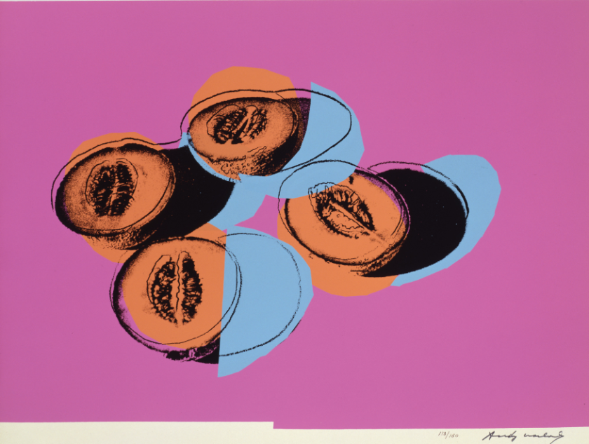
Take Cantaloupes II (main picture). Four cantaloupe halves lie - where? They can't be on a table because they are viewed from different perspectives - they don't seem to sit right. Some of their shadows fall beneath other colour planes, some above. The cantaloupes are luminously orange, except their orange ovals seep beyond their lines. There are intrusive light blue circles and semi-circles, and this all sits on large pink blocks, which don't quite occupy the entire paper.
 All of these things serve to discomfort but also to draw you in. The fruit hover between realistic portrayals, cartoon outlines, present objects, colourful abstracts. Everything bleeds across borders of reality. The colours do not just highlight the transitions between these states but enable them by allowing us to dismantle the image. You can never stop looking because each piece of fruit is in perpetual flux: the life in these melons is anything but still.
The best thing is that there are six different pictures in this series here, each with its own challenge to the nature of the image, each a challenge to still lifes of the past and a tribute and answer to Cezanne with his apples. You could spend hours caught in their shifting, puzzling beauty.
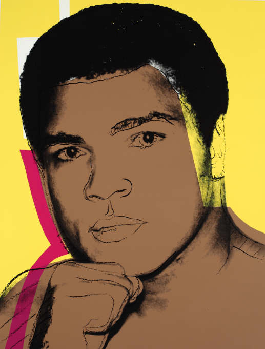
The third room returns to celebrity subject-matter, but after Space Fruit their whirling possibilities become all the more entrancing. Muhammad Ali (1978) (pictured above left) reanimates Cubism with a Pop shot in the arm, using four different angles on Ali in one series, as opposed to the multiples of one picture as with the Marilyns. Again, Warhol's use of colour both fictionalises and reifies Ali, which means his portraits of the famous don't become adorations. Are these people real? The portraits don't help us.
Muhammad Ali hangs alongside Ten Portraits of Jews of the Twentieth Century (1980), where Warhol took his distortive use of blocks of colour even further. Frank Kafka is mostly pale blue, but a tiny radius of yellow begins and is quickly extinguished, while a deeper blue triangle points at his left eye. A rogue blue block sneaks in from the bottom. He is abstracted and terrified, mysterious and modern. A blue rectangle is slapped onto Louis Brandeis' forehead and the whole picture feels like it's coming dangerously close to abstraction. Einstein is mainly drawn lines, rather than a photo.
Warhol has gone back to what he knows best: kitsch
Given the subject matter - modern Jews - this technique feels fitting: the shocking colours and glaring blocks are a hysterical response to hysterical, dangerous times; the use of photos and lines permits a shifting between mythology and reality; and there is that comedy-tragedy vital to traditional Jewish humour.
The final room is crowded like Morozov's drawing room, twenty pictures hanging from three walls. Drawn from the Myths (1981) and Endangered Species (1983) series, it feels like we have regressed somewhat. The daring years 1979-1981 have ended up where they started, with rather ordinary Warhols, if there can be such a thing: pop culture icons in bright colours. The spirit of exploration seen in the previous two rooms has subsided and Warhol has gone back to what he knows best, kitsch.
If the flanks of Andy Warhol: The Portfolios disappoint, the central rooms thrill, more than thrill - entrance, excite and enliven. If you want fresh evidence of Warhol's genius, it's only three stops from Victoria Station.
GREAT POP ART RETROSPECTIVES
Allen Jones, Royal Academy. A brilliant painter derailed by an unfortunate obsession
 Ed Ruscha: Fifty Years of Painting, Hayward Gallery. First British retrospective for a modern master
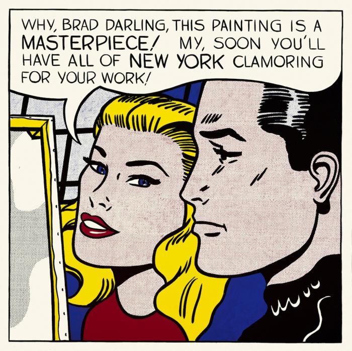
Lichtenstein: A Retrospective, Tate Modern. The heartbeat of Pop Art is given the art-historical credit as he deserves (pictured above, Lichtenstein's Masterpiece, 1962)
Patrick Caulfield, Tate Britain. A late 20th-century great emerges into the light
Pauline Boty: Pop Artist and Woman, Pallant House Gallery. The paintings are wonderful, but the curator does a huge disservice to this forgotten artist
Richard Hamilton, Tate Modern /ICA. At last, the British 'father of Pop art' gets the retrospective he deserves





Add comment