Stanley Kubrick: The Exhibition, Design Museum review - immersive detail | reviews, news & interviews
Stanley Kubrick: The Exhibition, Design Museum review - immersive detail
Stanley Kubrick: The Exhibition, Design Museum review - immersive detail
Concentrated archive show reveals the prodigious ferment of a film imagination

Who would have known that the word “Kubrickian” only entered the Oxford English Dictionary last year? You’d have thought that one of the great film directors of the 20th century would have earned his own epithet long ago.
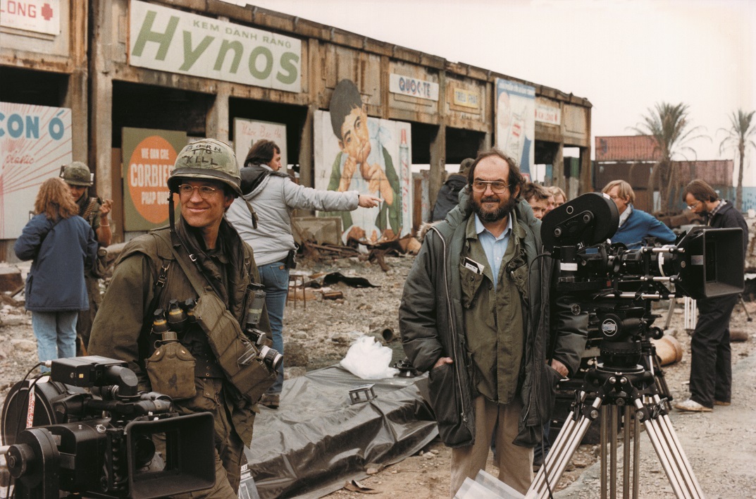
Was it worth the wait? Unquestionably. That OED definition mentioned “meticulous perfectionism, mastery of the technical aspects of film-making, and atmospheric visual style in films across a range of genres” as among the Kubrick attributes, and any visitor, no matter how well (or how little) they know the films, will come away with a much expanded insight into the director’s working life – how he functioned, how his ideas developed – from an experience that is genuinely immersive. If you’re determined to read every label here, to give proper attention to every clip, plan on it taking about as long to get round Stanley Kubrick: The Exhibition as you would devote to his blockbuster Spartacus (which comes in at a whopping 197 minutes). Does it catch the quintessence of the cinema itself? Inevitably not. It’s like Kubrick said of his greatest unrealised film project, the Napoleon biopic that would have been bigger than anything else he made, “It’s impossible to tell you what I’m going to do except to say that I expect to make the best movie ever made.” The telling – the almost limitless content, the boundless elucidation that the enormous Kubrick archive, only a tiny fraction of which is here, offers – can only go so far. Nothing original in saying that, of course: for the rest, you (re)visit the films (the current BFI retrospective offers a good place to start). (Pictured above, Matthew Modine and Stanley Kubrick on the set of Full Metal Jacket: the Hue scenes were shot at Beckton Gasworks in Newham)
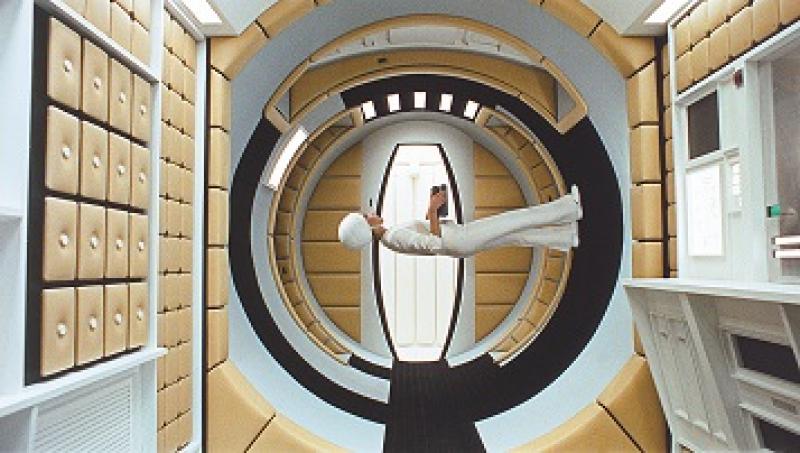
The exhibition’s first room, by far its largest, certainly sets out the scale of the task ahead: those that follow are arranged by film, but not – an interesting choice in itself – chronologically, the best rather saved to last, with Barry Lyndon leading into the 2001: A Space Odyssey finale. The three 1950s American films are here, but so is Napoleon and the other projects Kubrick never made – his Holocaust film, The Aryan Papers, and A.I. Artificial Intelligence, which ended up with Spielberg later, because the technology just wasn’t invented yet. Not that that usually stopped Kubrick, a technical innovator if ever there was one: the centrifuge model for 2001 is here, alongside an elucidation of the extraordinary slit-scan technique for that film’s Stargate sequence. That last element is a reminder that Kubrick didn’t pioneer everything himself, with Douglas Trumbull brought over from the US to achieve those unforgettable results.
That overriding attention to getting everything just right is evident throughout the show
Trumbull characterised Kubrick’s fanatical attention to detail as generously as anyone could, calling it “extreme quality control”, though the road from that to the downright compulsive is surely perilously short. It’s still hard to know what to make of someone who had a special type of cardboard file-box designed for him: the lid should be “not too tight, not too loose but JUST PERFECT”. (The Kubrick box is still in production.) That overriding attention to getting everything, down to its very smallest element, just right is evident throughout the show, and it surely throws up another insight: Kubrick’s was an art in which creativity combined naturally with intellectual excitement, no dissociation of sensibility here.
His creative independence clearly took some working for, as the director remembered about his work on Spartacus: “It’s the only picture I’ve worked on where I was employed – and in a situation like that the director has no real rights, except the rights of persuasion… and I’ve found that’s the wrong end of the lever to be on.” How crucial his relocation to England, beginning with the two Peter Sellers films Lolita and Dr Strangelove, must have been, on every level – that crucial distance from the Hollywood studios, a new cultural world opening up around him, the excitement of the 1960s.
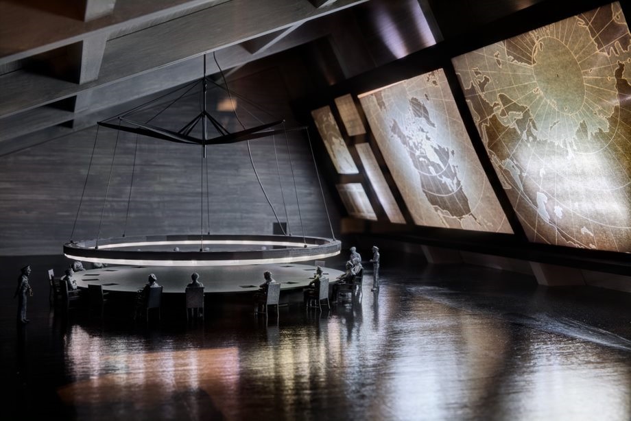
Did that independence bring with it a kind of megalomania? One early collaborator, from the New Yok days, remembered, “Anybody who worked with Stanley did just what Stanley wanted” – but you could probably say the same about many, if not most in that career. Contradictions abound, the number of takes he would insist on for a shot, set against the sympathetic on-set atmosphere others remember. What is clear is that he was always an explorer on the technical front, whether developing those Zeiss lenses (originally intended for NASA) that allowed him to shoot the interiors of Barry Lyndon by candlelight (the special three-wick candles are on display here), or in the pioneering Steadicam work of The Shining. There were invaluable collaborators along the way, especially on the design front, such as Saul Bass, responsible for the Spartacus title sequence as well as for revising the poster design for The Shining so many times until Kubrick was content. In the UK, he teamed up with Ken Adam, whose designs for Dr Strangelove (pictured above, model of Ken Adam's War Room design) are simply stunning. Spielberg’s famous tribute – “He said ‘Ken, that War Room set for Strangelove is the best set you ever designed.’ Five minutes later he came back and said, ‘No, it's the best set that's ever been designed’” – gets a well-deserved reprise here, but no mention of how the frustrations of location work on Barry Lyndon drove Adam to a breakdown (“This was Stanley's character – with all his fears and anxieties, he was relentless,” Adam remembered late in life).
Another such talent was costume designer Milena Canonero, whose collaboration with Kubrick began with A Clockwork Orange. That film especially, along with the fact that Stanley Kubrick: The Exhibition is showing at the Design Museum, underscores how he could catch the texture of an era, whether in architecture – the brutalist locations of Thamesmead – or industrial design. “There is a sexiness to beautiful machines, the smell of a Nikon, the feel of an Italian sports car, or a beautiful tape recorder,” he would say in a 1968 interview, his words ringing especially true in this location.
But there was no limiting Kubrick to the boundaries of the known, of course, as 2001: A Space Odyssey would make indelibly clear. Jan Harlan, his long-term producer (and brother-in-law), who was also one of those instrumental in bringing this exhibition together, has put that very nicely, citing a line of Cocteau that somehow captures the essence of Stanley Kubrick: “I didn’t know it was impossible – that’s why I did it.” You come away from this show with a new sense of how the prodigious ferment that was Kubrick’s imagination, backed up by his vital intelligence, allowed him to achieve just that.
rating
Share this article
The future of Arts Journalism
You can stop theartsdesk.com closing!
We urgently need financing to survive. Our fundraising drive has thus far raised £49,000 but we need to reach £100,000 or we will be forced to close. Please contribute here: https://gofund.me/c3f6033d
And if you can forward this information to anyone who might assist, we’d be grateful.

Subscribe to theartsdesk.com
Thank you for continuing to read our work on theartsdesk.com. For unlimited access to every article in its entirety, including our archive of more than 15,000 pieces, we're asking for £5 per month or £40 per year. We feel it's a very good deal, and hope you do too.
To take a subscription now simply click here.
And if you're looking for that extra gift for a friend or family member, why not treat them to a theartsdesk.com gift subscription?

Add comment