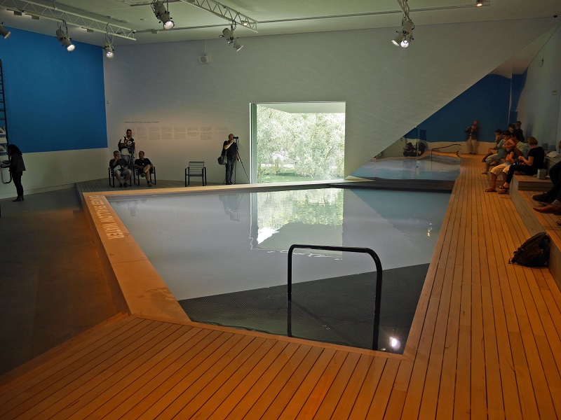
Arts festivals the size of the Venice Biennale are inevitably patchy. The appointed directors are hardly ever given enough time to curate and fill absolutely vast volumes of space. They can exhort the many national and individual participants to follow their lead, and yet they have no editorial control over them. And so for this year’s architecture biennale, with its theme of social responsibility – Reporting from the Front – set by director Alejandro Aravena, consider the newly-built Australian pavilion. This proudly features a swimming pool. Nothing else, apart from some voices.
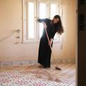
A swimming pool speaks of affluence, of sybaritic existence, even if that's far from the intentions of the curators who are using it as a metaphor for water as the source of life (pictured below right: the Australian swimming pool). But if Australia seems to be off-message – equally Russia with its curious display of Soviet-era architectural iconography – most of the national contributions do for once take the theme seriously. Aravena leads by example as a Chilean activist architect who has pioneered new forms of affordable housing and won his profession’s most valuable prize, the Pritzker, for his pains. This biennale, then, is all about the real lives of ordinary people, as assisted by architects. Refugees, migrants, the urban poor, the disenfranchised, even the young professional middle class who cannot afford to buy, and struggle to rent, a home. Making do and getting by.
 That’s fine, but this is Venice and a touch of glamour is required to sustain interest and pull in the crowds over the six-month period that the biennale runs. Never has there been a lower headcount of the globe-trotting star architects who normally form the highlights of these shows, and even those who have turned up have turned down the “me” volume. Norman Foster showcases a product of his charitable foundation, a “Droneport” for delivering medical and technical equipment to remote parts of Africa, built on the quayside of the Arsenale complex. Richard Rogers sets out another of his manifestos for socially-balanced cities, in searing pink as always.
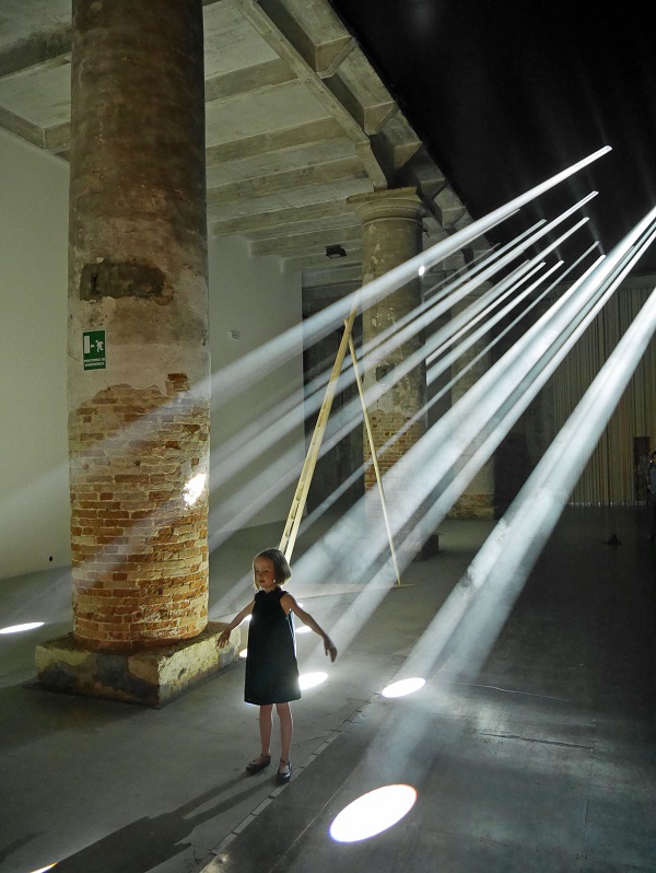
Only that old showman, biennale veteran Jean Nouvel from Paris, creates a grand gesture in the form of concentrated beams of light, sweeping across the processional route of the ancient Arsenale Ropewalk building (pictured below right). Everybody wants to be photographed there. Elsewhere, you find some remarkable structures made from ancient, local materials – stone and brick – like an impressive parabolic latticework arch in brick by Paraguayan architect Solano Benitez.
The British? The strong ideas in our exhibition by young curators Jack Self, Shumi Bose and Finn Williams come across much, much better in the accompanying book than they do in the pocket palazzo of our always-awkward, compartmented pavilion. Called Home Economics, it addresses new kinds of housing in a sequence of rooms designed according to timespan – places to stay for hours, days, months, years and decades. Real homes rather than property-investment chips. But the rather mute exhibition design, in which these rooms are expressed as indicative full-scale architectural models with virtually no explanation, doesn’t grab your attention. Apart from some giant beachball-like inflatable pods for the Days section, which are fun if scarcely practicable.
 A more accessible British-originated exhibition hardly deals with architecture at all. This is A World of Fragile Parts from the V&A, a first in being an applied arts strand in the show, which deals with the vexed business of the reproduction of historic artefacts – something very current now, with plans to digitally recreate monuments destroyed by war.
Germany deploys the simple architectural expedient of cutting large open portals out of its daunting Nazi-era pavilion, bringing in air, light, birdsong and giving views out across the Lagoon. The message, simplistic yet powerful, is that Germany is open to refugees. Though for me the best national pavilion purely as an architectural experience is that of the Baltic States, who have taken over a wonderful 1970s Brutalist sports hall and unified it with an artfully draped white canopy.
Everyone is looking for new ways to house people and to reuse existing places, and the United States presents a series of plans to reinvigorate post-industrial Detroit (main picture). Elsewhere in town, you find a big memorial show to the late Zaha Hadid, which reminds you how the architectural biennales used to be all about the shock and awe of icon buildings. New ideas from emerging talents populate the Palazzo Mora up in the Cannaregio district. But by the time you get there, you'll be flagging. Architecture is always intense and the trouble with Venice is that there's just too much competing for your attention. But overall – this is the "alternative" architecture biennale. It’s somewhat piecemeal, but it addresses vital issues and it hangs together. And besides, the city has plenty of glamour to offer elsewhere.
- The 15th Venice Architecture Biennale continues until November 27
Click on the thumbnails to enlarge








Add comment