The Drowning | reviews, news & interviews
The Drowning
The Drowning
Not waving but... well, you know

Hardcore First Person Shooter (FPS) fans have their own preferences for controlling their favourite 3D action games. This usually boils down to the little/big-endian dichotomy of analogue thumbstick controller or mouse+keyboard combo (WASD for movement and strafing, space to jump, click to fire.
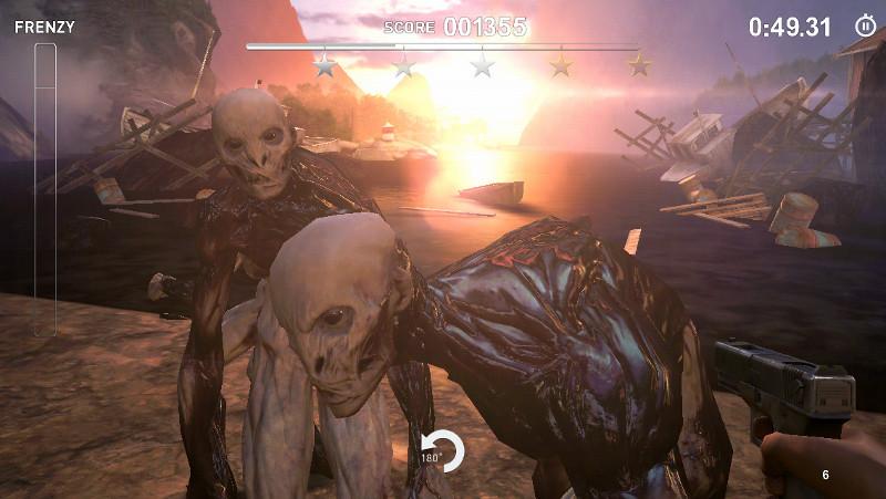
The Drowning is presented as an attempt to change the way FPS games are played on touchscreen devices. Rather than onscreen joypads or fire buttons the game adopts the kind of touch gestures already familiar to touchscreen users. To move, just tap an area of the screen and your characer will run to that location, pathfinding its way around any obstacles in the way. Swiping the screen looks around and a tap of a "turn around" button will execute a rapid 180 so you can deal with any threats to the rear.
 Shooting is performed via tapping too. Tap two fingers on the screen and you shoot at the exact mid point between your fingertips. This is perhaps The Drowning's cleverest idea and it does add a genuine element of marksmanship to the game.
Unfortunately, that is where the cleverness stops. The Drowning is on the whole a pretty dismal experience. The tap'n'swipe controls are tolerable but don't feel well suited to an FPS. Because negotiating the environment is left to a pathfinding algorithm, you never feel as if you are really using it to your advantage. There is no sense of cover or trying to gain an advantageous position. The location just serves as a series of places to retreat to when surrounded by enemies.
It is quite telling that the developers have left in the option to play with "traditional" onscreen controls. This gives some finer control over movement but at the expense of shooting accuracy, although the game doesn't really feel more or less fun as a result.
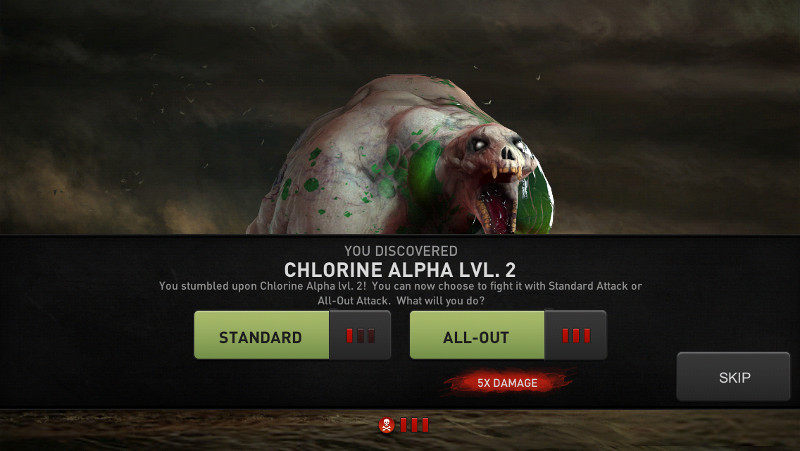
 Wonky controls would be forgiveable if the game was more engrossing, but sadly the developer's real ingenuity seems to have been poured into creating the in-app purchasing system (splash the cash, left). Like Candy Crush before it, The Drowning is not so much a game as an engine for siphoning cash from its players. To progress in the game you need to upgrade weapons (to defeat tougher monsters), buy fuel (to travel to new locations) and most irritating of all, to buy time to actually play the game. You quickly run up against unbeatable foes, inaccessible areas and a stingy daily play limit, all of which can be overcome with a little in-app payment.
Candy Crush, however, has the advantage of actually being an addictive game. The Drowning's post-apocalypse-blah-blah-something-about-zombies-and-oil plot is just a figleaf for drab, uninvolving shooting gallery levels that must be ground through in the search for loot and weapon components. You don't explore this game, you are just dropped into formulaic arenas that serve only to conceal waves of enemies, some of which you can pay £££ to defeat if you don't want to play the same levels again and again. What a waste of a potentially good idea.
- The Drowning is available now on iOS. Published by Mobage Inc.
- Read other gaming reviews on theartsdesk
- Follow Stuart Houghton on Twitter
The future of Arts Journalism
You can stop theartsdesk.com closing!
We urgently need financing to survive. Our fundraising drive has thus far raised £49,000 but we need to reach £100,000 or we will be forced to close. Please contribute here: https://gofund.me/c3f6033d
And if you can forward this information to anyone who might assist, we’d be grateful.

Subscribe to theartsdesk.com
Thank you for continuing to read our work on theartsdesk.com. For unlimited access to every article in its entirety, including our archive of more than 15,000 pieces, we're asking for £5 per month or £40 per year. We feel it's a very good deal, and hope you do too.
To take a subscription now simply click here.
And if you're looking for that extra gift for a friend or family member, why not treat them to a theartsdesk.com gift subscription?
more Gaming
 'We are bowled over!' Thank you for your messages of love and support
Much-appreciated words of commendation from readers and the cultural community
 Kelly Clancy: Playing with Reality - How Games Shape Our World review - how far games go back
The acclaimed neuroscientist on the world and history of games, in all their variety
 Rage 2 review – garish but great post-apocalyptic shooter
Challenge The Authority in this 'Mad Max on mushrooms' renegade romp
 World War Z review - bloodthirsty fun with the zombie apocalypse
Chainsawing the brain-eaters as you battle against the tide of the undead
 The Lego Movie 2 Videogame review - everything is not awesome
Few fresh ideas means this movie adaptation treads the same old ground
 Anthem review - singing praises? More like a cautious nod
A rocky start for a new franchise that offers potential and problems in equal measure
 Crackdown 3 review - spectacular super-powered action that was great fun many years ago
Nearly a decade has passed since the last incarnation but little has changed in this stagnant shooter
 Battlefield V review - WWII on an epic scale
The veteran series returns for another ambitious tour of duty
 Fallout 76 review - how to wreck a perfectly good legacy with one messy game
When home runs go horribly wrong
 Red Dead Redemption 2 review - the cowboy drama makes a triumphant return
An ambitious Wild West odyssey that matches epic scale with benchmark skill
 Call of Duty: Black Ops 4 review – less is more
Solo rations have been relegated from this benchmark war series
 FIFA 19 review - the best just got a bit better
It looks and plays great, but what’s new?

Add comment