Frank Bowling, Tate Britain review - a marvel | reviews, news & interviews
Frank Bowling, Tate Britain review - a marvel
Frank Bowling, Tate Britain review - a marvel
Major retrospective of one of the greatest painters alive today

In a photograph taken in 1962, Frank Bowling leans against a fireplace in his studio. His right hand rests on the mantlepiece which bears books, fixative and spirit bottles, his left rests out of sight on the small of his back. His attire is somewhat formal but decidedly casual — trousers loose enough to bend in, a striped jumper with the sleeves rolled up, workman-like, and a shirt which looks like it has several top buttons undone.
The artistic urge and its mechanical rendition are depicted as adjacent triangles: the sides of “ACTION (MOTIVE)” are identified as “Receiving”, “Maintenance” and “Exchange” while “PAINTING” signifies the primary and secondary colours. Taken together, these details suggest paradoxes — stability and movement, confidence and delicacy, ease and formality, bohemian loucheness and academic rigour — but they’re held together by Bowling. Out of frame is a window and light falling across his face lends his pensive expression a visionary air.
Almost six decades on and Tate Britain’s solo exhibition is a marvel. At 85 and now in a wheelchair, Bowling still goes to his studio most days, and it is clear he has worked closely with curator Elena Crippa on the show. The exhibition progresses chronologically, each of the nine rooms providing a distillation of Bowling’s work during a particular period. Through it we are treated to paintings both lyrical and arresting, aleatory and determined, and shown how he has consistently framed and reframed questions around memory, painted space, identity, aesthetics, light and artistic expression, allowing new answers and configurations to arise at each moment. It feels distinctly like a celebration. Early work, such as Birthday, 1961, attests to the early influence of Bacon’s psychologically potent figuration (they were friendly until an evening of companionable drinking led to an accidentally hurtful discussion over two- and three-dimensional space, which resulted in a break). The painting, which is dominated by a toxic orange and dirty putty white, draws on Bowling’s memory of a neighbour giving birth in his home town of Bartica in Guyana, and his horror at the brutality of the occasion. The woman’s face is ruptured into a dark howl and one leg slung unnaturally up, away from the seeping blood at her genitals. Yellow window frames which open into the canvas bisect her torso, while constructing a strange, staged air around the scene. Viewers are voyeurs — of her pain on the canvas and of the rawness of Bowling’s recollection.
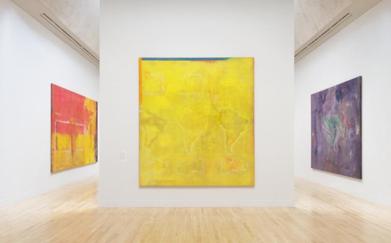
Later paintings treat memory differently. In the gloriously large room (main picture) dedicated to his map paintings made in New York, Bartica, 1968-69, is screen-printed both with yellow photographs of his sons who were then living in England and photographs by Tina Tranter from their 1968 trip to Guyana. For all the competition of pink and green, these are memories, connections and meanings he cannot quite relinquish to abstraction. It’s as if they’re an emotional substrata that has slipped into the painting’s ligature and been partially ingested by colour. Distinct sentiment lies beneath the surface, somehow still recognisable.
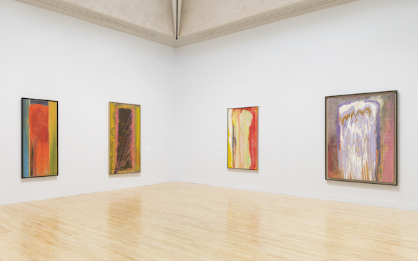
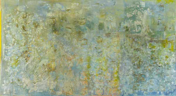
“Colour affects the eye and the heart, physically and metaphorically, more directly than any other single element in painting,” quoted Bowling from Martha Tucker’s Structure of Colour, in a 1972 article for Arts Magazine. A year later, he started playing with chronology, naming his poured paintings (pictured above) after they had been made. A tilting platform allowed him a degree of control over the flow of contrasting paints but the affect and visual result foreshadowed narrative. Viewed together in a single room, they’re striking — like a congregation of mineral shafts. Taken individually, they beckon close readings, each having its own procedural story: how did Kaieteurtoo, 1975, achieve that weird double dip at the bottom of the canvas? Why is it that Tony’s Anvil, 1975, conveys jazzy disobedience and jagged independence? How surreal is the sensation of looking at Yonder, 1976, as if onto a field of lava through thin windows? In the article Bowling surmised that “paint colour is not just simply different from nature colour, it also does different things to the head and body” — but for him the link between depiction and reality persisted, albeit in less obvious ways. A room of four glorious paintings of the Thames from the 1980s in particular reflects on this (Thames IV, 1988-89, pictured above), immersing viewers in space that is both light and glutinous, patterned with the overlapping swells of the river’s sluggish, estuarine, mercurial movement. His wall-bound theory made a crucial distinction between paint and light (light’s third colour is green, rather than yellow); here his canvases begin to elide that space. Impasto acrylic gel combine with pearlescence to cause canvases to slip beneath the eye as both a simulacrum of moving water and its own painted reality. At this point Bowling was living close to the river, in Pimlico, and it’s almost impossible not to smell the brackish Thames' sluggish seaweed, and place Bowling in the long line of English painters who have made light their subject (Turner chief among them, though they also seem to reference the grandeur of Monet’s late, grand paintings in the Tuileries in Paris).
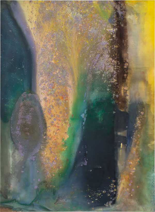
Another room looks at his relation to colour on an almost cosmic level. Ah Susan Woosh, 1981 (pictured below), appears like the bird's eye view of a decoalescing sandbank, rivers of capillaries snaking down its sides. A bar of pure sand purls from a combing of green like breath reaching the sea. Its right is more mixed, as if somewhere beyond the painting's base the thin colours separate, unmuddy, clarify. Elsewhere, eruptions, pure waters and volcanic minerals flow. The sense of geographic time is measured out in the seconds it took for Bowling to sweep liquid colour from space to space across the canvas before it solidified. This is eternity in emotional microcosm.
 Yet, however close he strayed to pure abstraction, whether through words or paint, Bowling wove history in. Silver Birch (No Man, No Vote), 1985, refers to Nelson Mandela who that January refused an offer of conditional release stating that violence was a legitimate form of resistance when other options did not exist. Two quiet, white paintings from 2005 — From V2 - RS1 and Haze — one of which carries acupuncture needles used to treat Bowling’s back pain, refer to the death of his son Dan in 2001. Ashton’spunge, 2011, tells gloriously of how mistakes in the studio were incorporated into Bowling’s work. Like a river, the exact course of each work is found through an enfolding of direction and circumstance. The items that arrive onto and into the canvases (bottle caps, caps of fabric, rope) are traces of how he lived and worked. A photograph from his studio in SoHo in 1971 shows both paint brushes and an empty meal bowl, a half-finished bottle of wine and cans of spray paint. In the background a clothes rail suggests the proximity of Bowling’s personal and professional lives.
Bowling described his mother’s store as "a window out of which I looked at the world”. It is frequently depicted in his early work but receded in prominence as he found his own artistic voice. His sense of the canvas, too, changed, with the flat plane becoming something in which viewers could immerse themselves — but he never quite gave up on that argument with Bacon. A refrain of painted frames remains throughout the show — sometimes subtle, sometimes bold, often only on one side — little mementos that these are two, not three dimensional space, no matter how alive they appear. In a pair of photographs from 2016, we see the interior of Bowling’s Brooklyn loft studio. On the left is a sofa next to a cluttered desk. Canvas frames lean against the wall and we imagine how, on hot evenings, the electric fan pulls dark air cooled by the Hudson into the room. The insets of the windows are painted red, yellow, blue. Light and paint are adjacent — Bowling’s colour theory, reframed, again.
- Frank Bowling is at Tate Britain until 26 August
- Read more visual arts on theartsdesk
rating
Share this article
Add comment
The future of Arts Journalism
You can stop theartsdesk.com closing!
We urgently need financing to survive. Our fundraising drive has thus far raised £49,000 but we need to reach £100,000 or we will be forced to close. Please contribute here: https://gofund.me/c3f6033d
And if you can forward this information to anyone who might assist, we’d be grateful.

Subscribe to theartsdesk.com
Thank you for continuing to read our work on theartsdesk.com. For unlimited access to every article in its entirety, including our archive of more than 15,000 pieces, we're asking for £5 per month or £40 per year. We feel it's a very good deal, and hope you do too.
To take a subscription now simply click here.
And if you're looking for that extra gift for a friend or family member, why not treat them to a theartsdesk.com gift subscription?
more Visual arts
 'We are bowled over!' Thank you for your messages of love and support
Much-appreciated words of commendation from readers and the cultural community
 Lee Miller, Tate Britain review - an extraordinary career that remains an enigma
Fashion photographer, artist or war reporter; will the real Lee Miller please step forward?
 Kerry James Marshall: The Histories, Royal Academy review - a triumphant celebration of blackness
Room after room of glorious paintings
 Folkestone Triennial 2025 - landscape, seascape, art lovers' escape
Locally rooted festival brings home many but not all global concerns
 Sir Brian Clarke (1953-2025) - a personal tribute
Remembering an artist with a gift for the transcendent
 Emily Kam Kngwarray, Tate Modern review - glimpses of another world
Pictures that are an affirmation of belonging
 Kiefer / Van Gogh, Royal Academy review - a pairing of opposites
Small scale intensity meets large scale melodrama
 Jenny Saville: The Anatomy of Painting, National Portrait Gallery review - a protégé losing her way
A brilliant painter in search of a worthwhile subject
 Abstract Erotic, Courtauld Gallery review - sculpture that is sensuous, funny and subversive
Testing the boundaries of good taste, and winning
 Edward Burra, Tate Britain review - watercolour made mainstream
Social satire with a nasty bite
 Ithell Colquhoun, Tate Britain review - revelations of a weird and wonderful world
Emanations from the unconscious
 Rachel Jones: Gated Canyons, Dulwich Picture Gallery review - teeth with a real bite
Mouths have never looked so good

Comments
I am interested in finding
i Knew Tina in the 50's when
i Knew Tina in the 50's when we were teenage lovers. after we parted i had no contact with her until the early 70' when i disciovered that we were both working in central London, she at Banks and Miles, and we used to have lunch together from time to time. Then i left London and had no more contact until the early 90's when i tried to contact her agai only to discover that she had died in 1987. More recently i have learnt that she left London in the early 80's, having given up photography, and opened a successful and popular seafood restaurant in Bath. She is buried in the Roman Catholic cemetary in the city. To me she was a wonderful person never to be forgotten