If there is a successor to the great Hollywood costume designer Edith Head, it is Sandy Powell, the British designer of six films directed by Martin Scorsese, three each by Todd Haynes and Neil Jordan, and others by the likes of Derek Jarman, Sally Potter, Stephen Frears and Julie Taymor. Powell’s recent Oscar nominations for designing the costumes for Haynes’s Carol and Kenneth Branagh’s Cinderella raised her total to 12: her wins have come for Shakespeare in Love, Scorsese’s The Aviator, and Young Victoria.
For all the fairytale flamboyance of Powell’s Cinderella gowns and tunics, closer scrutiny is invited by the subtle looks she created for early 1950s lovers Carol Aird (Cate Blanchett) and Therese Belivet (Rooney Mara), as well as for Carol’s husband Harge (Kyle Chandler), her best friend Abby (Sarah Paulson), and Therese’s young male friends. This interview with Powell, which took place last November, focuses on her designs for Haynes’s vision of repressive pre-Eisenhower America, rather than for Disney’s latest magic kingdom.
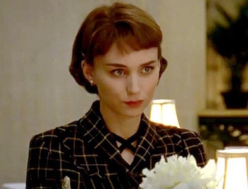 GRAHAM FULLER: The dominant pattern in Carol is check [pictured right, Rooney Mara], though not for Carol herself. I know some of the male characters have check on their clothes, but I wondered if the criss-cross bars in Therese's and Abby's outfits were intended to symbolise entrapment?
SANDY POWELL: I never, ever thought about that! [laughs]. I think it’s really funny when people look at my work and find all these deep, meaningful things behind it. I can understand that and I think it’s quite good, but, no, that wasn’t intentional. I tend to work instinctively and don’t over-analyse anything but do what comes from the gut and what I feel. But I like your interpretation, and it could be true – maybe I did that on purpose.
Was check popular in the early 1950s?
It was prevalent, yes. It was obviously a fashionable pattern for skirts, even pleated skirts. There is a lot of plaid in Therese’s clothes because the more I looked at vintage pieces from the period, the more I found. I use it to break up the plain look. Carol’s clothes, for instance, are very simple; they aren’t patterned, and the only embellishment is jewellery. I think check was the only pattern I used – there aren’t any florals or anything like that. Also, the film is set during the winter, so the fabric that’s used the most is wool, and quite often wool clothes are check.
Therese initially wears a red, yellow, and black tam o’ shanter, which seems a little childlike, like her headbands, but later on she favours a black beret. Is that a sign of her maturing over the space of a few months?
Again, I didn’t consciously use one and then move on to the other. I gave her two hats, though, in retrospect, I don’t know if I should have done; she has two scarves as well. She alternates the hats, but I think you just notice it more when she isn’t wearing the tam o’ shanter. It’s not really childish or childlike but a freer look for younger women, as headbands were for women whose hair is natural and who haven’t had a hairdo like an older, more sophisticated woman such as Carol would have.
 Carol wears red occasionally and favours red or orange accents in her clothes – a muted pink with matching nail polish at one point…
It’s a sort of pinky-orange or salmony-orangey colour – coral is the correct name (pictured left, Cate Blanchett). It was very fashionable in the period and incredibly flattering, I think, to Carol’s skin and her blonde hair. Because a lot of her colours are muted, I wanted her to have some bright-coloured highlights, whereas Therese’s highlights are primary colours, which goes with her being younger.
In Patricia Highsmith’s novel, Carol’s reds suggest blood and associate her with female predators in fairytales.
I am wary of using red because it does make people think you are telling a particular kind of story. Carol does wear a red hat and coat in one scene. The reds and the yellows come from a reference Todd provided at the start of filming. He had a look-book of images from street photographers, including Saul Leiter, whose work contains dark or muted colours or were shot at night or in rain. Reds and yellows are the colours that stand out in them under street lighting or neon lighting or in taxi cabs. That’s what I was doing with the reds. Carol doesn’t wear a red coat because it’s significant. I chose it for when she visits her lawyer’s office and visits Therese and goes with her onto her rooftop.
As Therese and Carol become intimate and their values start to coalesce, did you see their clothes becoming a little more similar?
Yes, though I don’t think it really shows until the end after they’ve been separated for a bit and Therese has been forced to get her life together and grow up, as it were. She gets a job and spends money on clothes – including that suit she wears at the end – and gets a haircut. She looks more sophisticated, and that’s the influence of Carol rubbing off on her. She doesn’t emulate her exactly. She has a different silhouette and is finding her own style.
It seems important that Carol doesn't wear her mink at the end.
It’s significant at the beginning because that’s what draws your eye to her in the department store. She doesn’t wear it at the end because three months have passed and spring is coming, so she’s wearing a lighter fabric and lighter colours. It’s a whole new start.
 When you’re working with Todd Haynes (pictured right, with Powell), whose films aren’t as highly financed as some of the Hollywood movies you work on, do you have to strike a balance between designing clothes and using existing clothes?
Todd’s film are made for considerably less money than big Hollywood films! [laughs]. I use existing clothes if they are right for a character and if they fit, but quite often they don’t. A lot of the original clothing from the 1950s is much smaller than what women wear today. Whereas I could get a lot of clothing to fit Rooney in the style I’d created for Therese, which was more casual than Carol’s, it was harder to get original clothing to fit Cate, though she does wear a few original pieces. I much prefer to design clothes because then I can get the exact colour, shape and proportion that I want, so I try where possible to make the clothes, even on a tight budget. I’ll cut back somewhere else in order to be able to build something.
What was the biggest challenge of making clothes for Carol?
It wasn’t difficult designing and making them, but the challenge was overcoming the lack of time and money. It’s about being creative and resourceful.
Did you work with [cinematographer] Ed Lachman on how the colours would look when photographed?
Ed and Todd, yes. We had a very short prep time, so there wasn’t time to do camera tests. Todd’s references were the key thing, and when I saw the finished film, I was amazed by how much it looks like his original look-book.
So he’d thought carefully about the clothes before you came on board?
Not specifically about the clothes. Todd thinks about everything, but he won’t give me an image of a person and say, “That’s exactly what I want her to look like", or “I want her to wear that shaped skirt”, or “that colour skirt”. It’s more general than that, but from talking to him I know where he’s headed.
Was it a different kind of experience from working with him on Far From Heaven?
No, very similar, in that Todd is well-organised and good at conveying information. Not all directors are so visual or as good at communicating what they want, surprisingly. Quite often they don’t know what they want until they see it.
Did you look at movies from the early 1950s?
Yes, though I can’t remember which ones. On Far From Heaven, I looked at Douglas Sirk’s films scene by scene, second by second. There wasn’t a particular film that influenced the clothes in Carol. Mostly it was still photography.
Were you influenced by the period's fashion designers, such as Christian Dior, Jacques Fath, and Cristóbal Balenciaga?
 Dior was, of course, doing the “New Look”, which I didn’t use. Dior did design for the kind of shape that Carol wears, but I didn’t think his full skirts were right for her – they were too extravagant and too high-fashion. I think it would have been too self-conscious to do something as obvious as that. More than designers, I looked at the work of photographers of the period, such as Gordon Parks, Clifford Coffin, Cecil Beaton, and all the photographers who were working for Vogue and Harper’s Bazaar. I looked at all the Vogues from the exact months in which the film was set [mid-December 1952 going into early 1953]. Most of the people in the film, who aren’t fashionable and can’t afford to buy new clothes every year, still dress like it’s the 1940s. I don’t think any decade really starts until it’s past the middle. Carol and Abby (pictured above, Sarah Paulson) are probably the only characters who are spot-on for ‘52.
Do you work with the same team of seamstresses each time you make a film?
It depends where I’m working. On Carol, I used one person I’d worked with before, and for the first time with the person who made Cate’s clothes. Generally, I try to keep the same supervisors and assistants, the people I’m closest to.
You’ve said in the past that you didn’t want to become a fashion designer because it puts too much emphasis on the clothes. Yet each time you start on a new film, you do in, a sense, have to create a collection for it.
Yes, but what I’m doing is designing for characters, not just items of clothing for anonymous people. I love clothes and I love fashion, but I think costume design gives you more scope to design a variety of things. As a fashion designer, you have to produce so many collections a year.
The men’s clothes in Carol are simpler, obviously less to do with finery. Did that make them easier to design or not?
They’re not really simple – an awful lot goes into designing the perfect tailored suit. They just don’t have so much decoration or accessorising. Though in a way they do – for Harge, I’d have to choose the tie, the shirt, the suit, the gloves, the coat, the hat. Men’s clothes have the same number of components as women’s – they’re just not as pretty. [Pictured below, Kyle Chandler as Harge.]
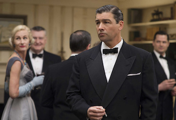 I was struck by the scene in the New York Times office where Therese is surrounded by men wearing a kind of uniform. They’re all wearing white shirts, a couple of them wear black waistcoats.
That’s a very un-dressed look, actually. It’s not normal for an office, but they’re newspapermen who have been working late, and it’s how you imagine they would look and how they looked in the visual references. They’re pretty conventionally dressed. They’d all have been wearing suits and ties – the ties all the time, except for the younger men. Some of them would have been wearing three-piece suits, which explains the waistcoats.
I was irritated – in a good way – by the fussy bow tie worn by the private detective Harge hires to follow Carol and Therese. It enhances that boy scout vibe he has.
I didn’t choose that from reading about the character. It came from meeting the actor [Cory Michael Smith] for the first time and trying different things on him. The bow tie worked with his physicality. That’s why I can’t design a costume until I know who’s wearing it. You can have an idea for a character, but until you know the actor playing that character, it’s impossible to do it. When you meet them, they might turn out to have a completely different shape or colouring to what you had in your head. You have to work with the body you’ve got in front of you.
This must have been a radically different experience to designing for Cinderella?
It was funny because Carol immediately followed Cinderella [laughs] – it was very, very different!
And you’re now designing for John Cameron Mitchell’s How to Talk to Girls at Parties, starring Nicole Kidman, Elle Fanning and Ruth Wilson. That means alien costumes, right?
Ohhh! Visiting aliens and 1977 punk, which is fun because I don’t think it’s been done much on film before, strangely.
It certainly hasn’t been done accurately.
No. I’m trying to do the punks as real as possible, which is not about brightly coloured hair and huge Mohicans. It’s the very early stage of punk where kids are customising their school uniforms with a bit of toilet chain.
Read other articles in We Made It, our series on craft in partnership with Bruichladdich







Add comment