Turner Prize 2011, Baltic, Gateshead | reviews, news & interviews
Turner Prize 2011, Baltic, Gateshead
Turner Prize 2011, Baltic, Gateshead
The Turner Prize galleries have never looked so good
Friday, 21 October 2011
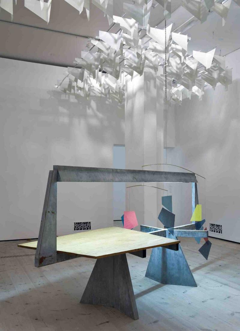
'Do Words Have Voices', 2011, part of Martin Boyce's installation for the Turner PrizeAll images © Colin Davison
The Turner Prize has headed to the North East. It’ll be back in London next year, thence to Derry for 2013. Tate Britain plan to host the prize biennially, with a regional public gallery presenting it in the years in-between. This must be hailed as good news for those who complain of London-centricity.
But as well as gaining new audiences, I do hope the prospect of leaving the capital won’t put others off, for this year the Turner Prize exhibition is looking very good indeed, and for that the Baltic must be commended for doing a fine curatorial job.
In fact, I can’t remember the Turner Prize galleries ever looking this good. I say this, despite just a few reservations concerning my previous firm favourite, George Shaw. Shaw was nominated for the prize for a survey show at the Baltic, an exhibition which moved to the South London Gallery, which is where I saw it. Shaw has been painting the same Coventry housing estate and its immediate environs, where he grew up, for the past 15 years, and the travelling exhibition spanned over a decade of his output. The paintings are painted with a very fine brush using Humbrol Enamel - the paint used for Airfix models - which gives them a hard, high-gloss finish.
 There were some outstanding works in that travelling exhibition, particularly the large-scale paintings such as Scenes from The Passion: The Cop Shop, 2000, and Ash Wednesday, 2004-5, particularly striking for their use of sickly, sulphuric yellow. But for his Turner Prize display Shaw has chosen to show only very recent work (pictured right: Shut Up, 2011), and although these are still individually impressive he’s come up against the problem of sameyness: the paintings are not only even more uniformly similar in colour, but they are also the same size, apparently all measuring the dimensions of the television set Shaw grew up watching. This means that he does, unfortunately, lose out to the more dynamic installations of the other artists.
Still, I retain a soft spot for Shaw, since his paintings are not only haunting, sad and nostalgic in ways that are archetypically English, but they are also beautifully and meticulously painted. In sensibility they have the humdrum yet devastatingly yearning quality of Larkin, who is an acknowledged influence. I would certainly cheer if Shaw won, but another artist, of whom I’d not even previously heard, has won me over with the seductive cleverness of his display.
Boyce’s work contains a multitude of references to, and riffs on, other artists
Martin Boyce must now surely be the favourite to win with an installation (main picture) that takes as its starting reference a series of sculptures by French Modernists Joel and Jan Martel in the 1920s. The Martels made four concrete trees for the Paris Exposition of 1925, and Boyce uses the “ready-made” columns of the gallery for the same representational purpose. But it takes a while to work this out – in fact, what’s so glorious about Boyce’s installation is that everything unfolds so gradually – and so what you first notice as you enter the small space is the ceiling.
The ceiling is covered in projecting forms which are trapezial in shape and painted white. Light is distorted through them, casting shadows on the wall and presenting a scene that glows with silvery dappled light. The trapezials represent foliage in this highly stylised garden or park, and these forms are echoed in the “fallen leaves” which are made of brown, paraffin-coated crepe paper and scattered in the corners of the floor, as if swept up by a park attendant. This soft autumnal touch contrasts with the industrial feel of the rest of the installation.
But what the work overhead reminds me of most of all is the reflecting, intricately geometric constructions of English artist Mary Martin, who often used mirror surfaces for her repeating forms. In fact, Boyce’s work as a whole contains a multitude of references to, and riffs on, other artists, including Caro and Calder in a sculpture inspired by a Modernist design for a table, but which could also, at a stretch, represent a piece of colourful playground equipment, and Frank Stella and the Boyle Family in a concrete wall panel. In fact, there are so many elements to this display that it keeps on delivering long after you’ve left the room; the more I think about it the more I find to like and the cleverer I think it is.
 This cannot be said of Hilary Lloyd, whose work (pictured right), whilst beautifully displayed, has almost no traction at all and therefore feels almost entirely inconsequential. Her films, which are elegantly mounted on black LCD monitors, come with baldly descriptive titles, Moon, Shirt, Tower Block, Floor. These items are represented in each of the works: a 1960s tower block pops into view and then slides out again, reappearing at different angles; the moon darts about on two screens divided into squares – many moons are juxtaposed with the repeated image of a clock tower; a shadowy figure in a shirt slowly emerges on a bleached-out screen and is slowly erased again, like something caught in the lazy, rhythmic ebb and flow of a tide; and three screens each feature a close-up of a wooden floor, on which we observe a tremulous shadow.
All credit to the Baltic for making Lloyd’s work look good as an installation, but I feel there’s little else to say about it other than to describe it. Its attempts at visual poetry leave almost no other impression on the mind.
 Finally, there’s Karla Black, whose raggedly ephemeral work using paint-daubed, scrunched-up Cellophane and sheets of paper dusted with chalk I have, on previous encounters, disliked immensely. Here it gains a kind of immersive monumentality that plays off nicely against its raggedy, throwaway nature (pictured left).
Black cites the influence of psychoanalyst Melanie Klein, who studied the way pre-language children interacted with objects and materials. And so she seeks to create work, with its mountain of crumpled sheets and fragrant bath bombs and powdery and smeary residues, which is concerned with its evocative, sensual and material nature. The use of pastel colours, coupled with the work’s scale and the fact that you have to delicately weave through and around things, is probably designed to make you feel like a child negotiating the world anew. I’m not sure it wholly succeeds, but it’s the first time I’ve seen her work looking this attractive. Well done to the Baltic for helping make it so.
But well done especially to Martin Boyce, who now looks like a very deserving front-runner.
- Turner Prize 2011 at the Baltic, Gateshead until 8 January, 2011
- Photographer Colin Davison's website
What’s so glorious about Boyce’s installation is that everything unfolds so gradually
Share this article
Add comment
The future of Arts Journalism
You can stop theartsdesk.com closing!
We urgently need financing to survive. Our fundraising drive has thus far raised £49,000 but we need to reach £100,000 or we will be forced to close. Please contribute here: https://gofund.me/c3f6033d
And if you can forward this information to anyone who might assist, we’d be grateful.

Subscribe to theartsdesk.com
Thank you for continuing to read our work on theartsdesk.com. For unlimited access to every article in its entirety, including our archive of more than 15,000 pieces, we're asking for £5 per month or £40 per year. We feel it's a very good deal, and hope you do too.
To take a subscription now simply click here.
And if you're looking for that extra gift for a friend or family member, why not treat them to a theartsdesk.com gift subscription?
more Visual arts
 'We are bowled over!' Thank you for your messages of love and support
Much-appreciated words of commendation from readers and the cultural community
'We are bowled over!' Thank you for your messages of love and support
Much-appreciated words of commendation from readers and the cultural community
 Kerry James Marshall: The Histories, Royal Academy review - a triumphant celebration of blackness
Room after room of glorious paintings
Kerry James Marshall: The Histories, Royal Academy review - a triumphant celebration of blackness
Room after room of glorious paintings
") Folkestone Triennial 2025 - landscape, seascape, art lovers' escape
Locally rooted festival brings home many but not all global concerns
Folkestone Triennial 2025 - landscape, seascape, art lovers' escape
Locally rooted festival brings home many but not all global concerns
 Sir Brian Clarke (1953-2025) - a personal tribute
Remembering an artist with a gift for the transcendent
Sir Brian Clarke (1953-2025) - a personal tribute
Remembering an artist with a gift for the transcendent
 Emily Kam Kngwarray, Tate Modern review - glimpses of another world
Pictures that are an affirmation of belonging
Emily Kam Kngwarray, Tate Modern review - glimpses of another world
Pictures that are an affirmation of belonging
, 2019 by Anselm Kiefer, . Emulsion, oil, acrylic, shellac, straw, gold leaf, wood, wire and sediment of electrolysis on canvas, 470 × 840 cm.") Kiefer / Van Gogh, Royal Academy review - a pairing of opposites
Small scale intensity meets large scale melodrama
Kiefer / Van Gogh, Royal Academy review - a pairing of opposites
Small scale intensity meets large scale melodrama
 Jenny Saville: The Anatomy of Painting, National Portrait Gallery review - a protégé losing her way
A brilliant painter in search of a worthwhile subject
Jenny Saville: The Anatomy of Painting, National Portrait Gallery review - a protégé losing her way
A brilliant painter in search of a worthwhile subject
 Abstract Erotic, Courtauld Gallery review - sculpture that is sensuous, funny and subversive
Testing the boundaries of good taste, and winning
Abstract Erotic, Courtauld Gallery review - sculpture that is sensuous, funny and subversive
Testing the boundaries of good taste, and winning
 Edward Burra, Tate Britain review - watercolour made mainstream
Social satire with a nasty bite
Edward Burra, Tate Britain review - watercolour made mainstream
Social satire with a nasty bite
 Ithell Colquhoun, Tate Britain review - revelations of a weird and wonderful world
Emanations from the unconscious
Ithell Colquhoun, Tate Britain review - revelations of a weird and wonderful world
Emanations from the unconscious
 Rachel Jones: Gated Canyons, Dulwich Picture Gallery review - teeth with a real bite
Mouths have never looked so good
Rachel Jones: Gated Canyons, Dulwich Picture Gallery review - teeth with a real bite
Mouths have never looked so good
 Yoshitomo Nara, Hayward Gallery review - sickeningly cute kids
How to make millions out of kitsch
Yoshitomo Nara, Hayward Gallery review - sickeningly cute kids
How to make millions out of kitsch
Comments
All photography on this page
Many apologies to you, Colin.
Many apologies to you, Colin.
Hi Ismene, Thanks for that