Cutting Edge: Modernist British Printmaking, Dulwich Picture Gallery review - a cut above | reviews, news & interviews
Cutting Edge: Modernist British Printmaking, Dulwich Picture Gallery review - a cut above
Cutting Edge: Modernist British Printmaking, Dulwich Picture Gallery review - a cut above
Excellent exhibition sheds light on linocuts of neglected Grosvenor School Modernists
Wednesday, 19 June 2019
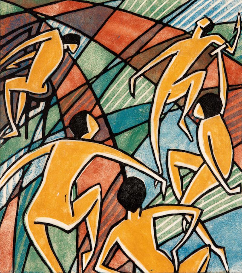
Falling into lino: Dorrit Black's 'Music', 1927-28© Elder Bequest Fund 1976, Art Gallery of South Australia, Adelaide
Under a turbulent sky racked with jagged clouds suggesting bolts of lightning, pale figures hurl themselves into a spitting expanse of water. Swathed in white towels, other figures mingle with the pink bodies, seeming to process along the pier as if towards a baptism. Swimmers’ vigorous arms overtop their submerged heads; on land, no individual face is distinguished. As if exuberance could tip at any time into anarchy, a sense of threat pervades the depiction of communal leisure.
By the time the Second World War broke out, the invincible boys depicted in Claude Flight’s linocut, Boys Bathing, 1935, would be old enough to fight. As such, the unsettling nature of the print could be considered a dark prefiguration of the onset of war.
 Yet much could be said in a similar vein about many of the prints on display at Cutting Edge, the Dulwich Picture Gallery’s new exhibition focussing on the linocut work of the Grosvenor School artists. The school, which was founded in 1925 by Iain Macnab, became a crucible for British Modernism, which drew on Futurism, Vorticism and Cubism to treat everyday subjects in a manner that suggested speed, movement and even sound. Macnab recruited Sybil Andrews as secretary, and invited Andrew Power to give classes architectural drawing and Claude Flight to teach linocutting — all artists whose work features in the show alongside that of school’s students. As technology improved and the modern world speeded up, it is perhaps only in retrospect that a sense of disquiet can be discerned in prints that at the time depicted the vanguard of change — the furore of jazz, new types of sport and leisure, and people at work. What is clear, though, is the centrality of collective social experiences and a focus on the body and machinery.
The exhibition opens with a stark monochrome lithograph by Paul Nash of a blasted landscape (Void of War, 1918), a sombre drypoint — Returning to the Trenches, 1916 — by Christopher Richard Wynne Nevinson, and a stunning wood engraving by Edward Wadsworth of ships camouflaged with a pattern of his design (Camouflaged Ships in Dry Docks ("Dazzle Ships"), 1918. The early influences of linocut are clear — not least as Nevinson was both closely associated with Filippo Marinetti, the founder of Italian Futurism, and was a student with Flight at Heatherly’s School of Art in St John’s Wood. What distinguished linocut from its precursors was the ease with which materials could be found or improvised (an umbrella rib would do as well as a proper gouge) and their cheapness (linoleum having been designed as a cheap surface that could be easily laid and cleaned). Like photography and film, it was a new art form — unlike them, it demanded very little expense or specialist equipment. It was democratic. And colourful.
![Cyril Power, The Eight, © The Estate of Cyril Power. All Rights Reserved, [2019] / Bridgeman Images/ photo Photo © Elijah Taylor (Brick City Projects)](/sites/default/files/images/Cyril%20Power%20-%20The%20Eight.jpg "Cyril Power, The Eight, © The Estate of Cyril Power. All Rights Reserved, [2019] / Bridgeman Images/ photo Photo © Elijah Taylor (Brick City Projects)") Rooms are divided thematically into sport, the countryside, movement, public transport and posters. This allows for direct comparison between different artists’ approaches and showcases the diverse ways lino was treated as a medium.
Rooms are divided thematically into sport, the countryside, movement, public transport and posters. This allows for direct comparison between different artists’ approaches and showcases the diverse ways lino was treated as a medium.
In this context, Lill Tschudi’s prints are especially striking. The Swiss artist was only 18 when she arrived to study at the Grosvenor School in December 1929 but her attentiveness to bodily expression and meaningful composition was already adept. In Fixing the Wires, 1932, two men brace themselves in slings on either side of a pylon top bristling with transformers. One seems to be making his way down carefully while the one nearest with his back to us is still at work, slender white wire arcs attesting to the rest of his task and the accuracy with which Tschudi has laid the multiple print layers. The progression of work is implicit, as is the men’s reliance on each other. In Jeu de Boules, 1934, companionable competition is expressed through carefully observed hip tilts and easy postures. The weight of the balls held by the men appear to pull down their arms and shoulders, and in a decorative and imaginative flourish, Tschudi has patterned the balls with concentric rings so their visual busyness contrasts against the blocs of colour that compise jackets and playing area. The centre of social attention becomes the visual pivot which brings the print together.
Cyril Power, by contrast, was more interested in buildings — though as a practising architect this should be no surprise. One of his notebooks in a vitrine displays annotations on a preparatory sketch for his print Tube Station, 1927, arrows indicating the placement of lights and patches of shadows — almost as if he were reverse designing the staircase in paint. In his finished print of The Eight, 1930 (pictured above left), the compositional dynamism is ramped up (in comparison to the preparatory sketch) by inverting the direction of the oars’ draw and omitting the cox completely. Likewise, in The Tube Train, 1934, people appear like vaudeville characters: an air of jaundice hangs about their exaggeratedly sharp features and in their similar, cramped poses, they appear more like ribs of the carriage than individuals. On the other hand, a run of prints of sporting events along one wall shows a more nuanced appreciation of the body — curlicued, elfin limbs flying out to lend weight to speed and shape to design.
 Nevertheless, in an age of speed, vehicles were both a luxury and an artistic preoccupation. In Speed Trial, 1932, Power conveys velocity by turning the car’s wheels into candycane-swirled ovals and pitching back its perspective as if — like to a slow-shuttered camera — the artist’s eye cannot catch it in its correct proportions when in movement. Claude Flight’s Brooklands, 1929, sends horizontal licks of lilac and yellow flame along the cars’ runners like skirreted sparks. Printed on exquisite Japanese tissue paper, it’s as if the printed colour floats above its silky skin. In Sybil Andrews’ Speedway, 1934 (pictured above right), three riders on single gear motorbikes without brakes curve round a corner — while at the time it was entertainment, the goggled eyes of the riders, their identical postures and semi-military formation now appear sinister.
It is almost impossible to view these prints without considering how brief was the period of peace between the two world wars. With this in mind, even the most effusive prints become sombre. The exquisite Under Piccadilly, 1934, by Greengrass for instance, captures as many stories as there are commuters and depicts the tube station only a few years before it saw use as an air raid shelter. But while the work of the Grosvenor School largely fell out of favour by the 1940s, the London Transport posters which finish the exhibition are probably some of the most widely viewed examples of British Modernist art. This exhibition makes a strong case for continuing to draw attention to their work and acknowledging their influence on later artists.
- Cutting Edge: Modernist British Printmaking is at Dulwich Picture Gallery until 8 September
- Read more visual art on theartsdesk
In an age of speed, vehicles were both a luxury and an artistic preoccupation
rating
Share this article
The future of Arts Journalism
You can stop theartsdesk.com closing!
We urgently need financing to survive. Our fundraising drive has thus far raised £49,000 but we need to reach £100,000 or we will be forced to close. Please contribute here: https://gofund.me/c3f6033d
And if you can forward this information to anyone who might assist, we’d be grateful.

Subscribe to theartsdesk.com
Thank you for continuing to read our work on theartsdesk.com. For unlimited access to every article in its entirety, including our archive of more than 15,000 pieces, we're asking for £5 per month or £40 per year. We feel it's a very good deal, and hope you do too.
To take a subscription now simply click here.
And if you're looking for that extra gift for a friend or family member, why not treat them to a theartsdesk.com gift subscription?
more Visual arts
 'We are bowled over!' Thank you for your messages of love and support
Much-appreciated words of commendation from readers and the cultural community
'We are bowled over!' Thank you for your messages of love and support
Much-appreciated words of commendation from readers and the cultural community
") Folkestone Triennial 2025 - landscape, seascape, art lovers' escape
Locally rooted festival brings home many but not all global concerns
Folkestone Triennial 2025 - landscape, seascape, art lovers' escape
Locally rooted festival brings home many but not all global concerns
 Sir Brian Clarke (1953-2025) - a personal tribute
Remembering an artist with a gift for the transcendent
Sir Brian Clarke (1953-2025) - a personal tribute
Remembering an artist with a gift for the transcendent
 Emily Kam Kngwarray, Tate Modern review - glimpses of another world
Pictures that are an affirmation of belonging
Emily Kam Kngwarray, Tate Modern review - glimpses of another world
Pictures that are an affirmation of belonging
, 2019 by Anselm Kiefer, . Emulsion, oil, acrylic, shellac, straw, gold leaf, wood, wire and sediment of electrolysis on canvas, 470 × 840 cm.") Kiefer / Van Gogh, Royal Academy review - a pairing of opposites
Small scale intensity meets large scale melodrama
Kiefer / Van Gogh, Royal Academy review - a pairing of opposites
Small scale intensity meets large scale melodrama
 Jenny Saville: The Anatomy of Painting, National Portrait Gallery review - a protégé losing her way
A brilliant painter in search of a worthwhile subject
Jenny Saville: The Anatomy of Painting, National Portrait Gallery review - a protégé losing her way
A brilliant painter in search of a worthwhile subject
 Abstract Erotic, Courtauld Gallery review - sculpture that is sensuous, funny and subversive
Testing the boundaries of good taste, and winning
Abstract Erotic, Courtauld Gallery review - sculpture that is sensuous, funny and subversive
Testing the boundaries of good taste, and winning
 Edward Burra, Tate Britain review - watercolour made mainstream
Social satire with a nasty bite
Edward Burra, Tate Britain review - watercolour made mainstream
Social satire with a nasty bite
 Ithell Colquhoun, Tate Britain review - revelations of a weird and wonderful world
Emanations from the unconscious
Ithell Colquhoun, Tate Britain review - revelations of a weird and wonderful world
Emanations from the unconscious
 Rachel Jones: Gated Canyons, Dulwich Picture Gallery review - teeth with a real bite
Mouths have never looked so good
Rachel Jones: Gated Canyons, Dulwich Picture Gallery review - teeth with a real bite
Mouths have never looked so good
 Yoshitomo Nara, Hayward Gallery review - sickeningly cute kids
How to make millions out of kitsch
Yoshitomo Nara, Hayward Gallery review - sickeningly cute kids
How to make millions out of kitsch
 Hamad Butt: Apprehensions, Whitechapel Gallery review - cool, calm and potentially lethal
The YBA who didn’t have time to become a household name
Hamad Butt: Apprehensions, Whitechapel Gallery review - cool, calm and potentially lethal
The YBA who didn’t have time to become a household name
Add comment