Oh those Victorians! Hail Prince Albert whose far-sighted ambition led to Albertopolis, embracing museums, galleries, universities and the Royal Albert Hall. And what in the early 21st century do you do with the Victoria & Albert Museum itself: one of the world’s greatest museums occupying higgledy piggledy buildings which have been a-building, expanding and growing topsy-turvy for more than a century and a half?
In its largest building project since 1909, the museum continues to enhance, expand and change to meet different demands: demands from visitors, and demands from the objects themselves for ever higher standards of preservation, scholarship, conservation and display. A huge new development on Exhibition Road – dubbed the Exhibition Quarter – long in the planning and six years in the building, opened to the public on 30 June, designed by Amanda Levete’s architectural firm, in collaboration with Arup engineering, Wates construction, and other specialists. It is just the most visible part of the V&A’s long running Future Plan, marked by a week-long free festival of umpteen events, called "Reveal".
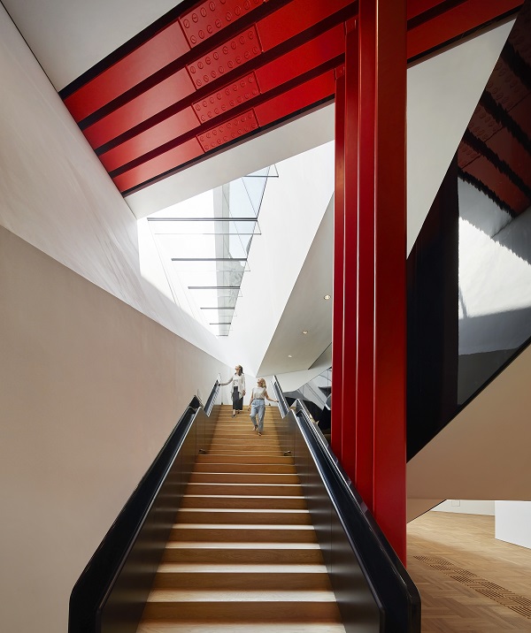 And what do you get? Well, really big bangs for your buck with much behind the scenes. There's an enormous new exhibition space in what was a basement, last used from 1981-1986 for the Conran Foundation-financed design exhibitions that preceded the Design Museum. Behind the scenes are spaces for storage, conservation and preparation, a loading bay for the whole museum (geared to the size of a maharaja’s Rolls Royce – you couldn’t make it up) and for access for each bespoke special exhibition. At last the V&A will have a specially created space for temporary shows, no longer reliant for its spectaculars (think McQueen, Bowie) on the continual recycling of the awkward east end spaces which decades ago were the public cafeteria. The new Sainsbury Gallery’s first extravaganza will be Opera: Passion, Power, Politics from 30 September, such hoped-for blockbusters providing significant financial support in these straitened times.
There are two vertiginous stairway entrances (and a lift) to the new gallery space (pictured above right). The Blavatnik Hall also has of course a shop, lots of facilities (bubble gum pink for both Ladies and Gentlemen) including a buggy park, as well as terrific views of the V&A’s big inner courtyard garden. There are easy entrances to the rest of the museum, taking us on the one hand to the ceramic staircase to upper floors and on the other through the galleries of Buddhist art and on to the sculpture gallery.
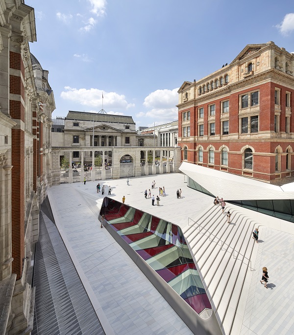 The whole also supplies a new entrance on Exhibition Road behind the arcaded 1909 Aston Webb stone colonnade of stone gates, each of the 11 now with its specially designed metal fencing with a pattern of royal arms, and echoes of the marks made by World War Two shelling (main picture). We enter the new external Sackler courtyard with a flooring of 11,000 bespoke porcelain tiles, made in Holland (pictured left). There is also a charming café: a new public meet and mingle space with elegantly minimalist tables and chairs designed by architects (perhaps the V&A should add them to their shop inventory). What is provided is a marvellous light hearted entry to the V&A, which as an entity can seem overwhelming, too grand and complex when first encountered.
The museum is finally visibly integrated into Exhibition Road and its companion museums, not to mention Imperial College. Moreover opened up to scrutiny is the red brick beautifully detailed west façade, and the wall of the Henry Cole Wing with its intricate architectural decoration.The western façade also had to be restored, conserved, even strengthened; the new Sackler entrance courtyard is also the ceiling of the new Sainsbury Gallery. A rather bewildering series of engineering conundrums therefore had to be solved, inevitable when integrating a 21st century build into a 19th century Listed Grade One piece of patchwork architecture.
This new way in to even more and better exhibitions, ease of access for visitors, and helping to make even more sense of the whole building too what the Great Court did in 2000 for the British Museum) is a highly intelligent and much needed expansion for the V&A. But I really do worry about the wet footprints – not to mention chewing gum – on all those lovely white porcelain tiles.







Add comment