The revamping of Tate Britain has produced such an atmosphere of understated elegance that one hardly dares breathe for fear of displacing a particle of dust. An air of suffocating sterility has seeped into the displays, which are so tastefully arranged that even the most passionate works are drained of emotion; and without a ripple of feeling ruffling the exquisite calm of these genteel waters, British art appears unrelentingly polite – and provincial.
Thank heavens for Phyllida Barlow who manages, single-handedly, to energise the space by filling the Duveen galleries with an installation that is riotously impolite, determinedly crude and magnificently potent. Dock refers as much to industrial architecture, piers, bridges and shipping containers as to the history of sculpture. Yet with slick fabrication techniques and hi-tech gizmos noticeably absent, it is highly traditional – in the best possible sense.
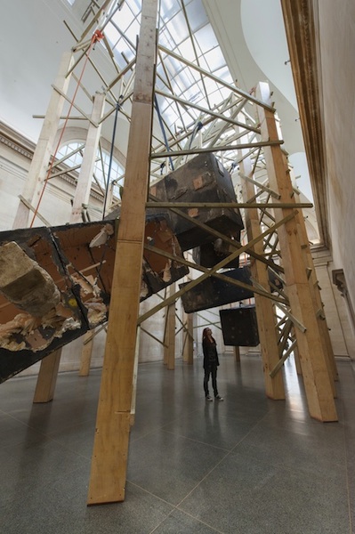 From 20 wooden piers hang five large containers darkened to resemble steel (pictured right). They look heavy, inert and potentially lethal, but they’ve been attacked by a battering ram. Furthest from the entrance hangs a specimen so badly damaged that its guts are exposed; this reveals nothing more substantial than layers of flimsy polystyrene attached to a steel frame by dozens of plastic ties. The battering ram turns out to be nothing more than a length of polystyrene darkened to look weighty and dangerous. This is pure theatre – film set bravado – deliciously-tuned to mock the macho heroics indulged in by heavy-metal sculptors such as American artist Richard Serra.
The exhibition spiel describes how the materials have been “suspended, collapsed, stacked, wrapped, folded and jammed”. It brings to mind a list famously compiled by Serra in 1967, citing actions that might produce sculptures: “to roll, to crease, to fold, to store....to support, to hook, to suspend, to spread, to hang”. They provide a remarkably apt description of Barlow’s working methods and there’s no doubt that the making process is as important to her as the end result. It's impossible to imagine her employing hundreds of assistants in a factory style set-up more like a production line than a studio.
Serra became famous in the 1970s for sculptures made from sheets of corten steel precariously balanced in unstable configurations that threatened to crush anyone venturing too close. His installations have since become larger and more bombastic, but health and safety regs demand that the steel be fixed so the threat is imaginary rather than actual. In 1992 Serra was invited, like Barlow, to occupy the Duveen Galleries and he installed two heavy-duty steel blocks in the north and south rooms respectively. In Barlow’s installation it looks a though his boxes have multiplied, levitated and been exposed as a sham.
 Her exhibition is more than simply a response to Serra, though; she is poking gentle fun at all macho pretensions and overblown erections. Crushedtower is a wobbly cylinder of battered cardboard held together with expanding foam and gaffer tape (pictured left); it reaches toward the vaulted ceiling, but its lofty ambitions are compromised by crumpled imperfection.
Filling the octagon Emptystaircase/hoarding is an unruly grid of 2 x 4” resembling the backside of a billboard or the underside of a football terrace. It supports a wall of plywood offcuts that look as if they were used to protect a floor, while inept decorators splashed pale green, black and orange paint around the place. As much emphasis is given to the support structure as the hoarding which, in any case, advertises nothing more glamorous than DIY ineptitude. In a society obsessed by glossy facades and physical perfection, the suggestion that slipshod efforts are more interesting than flashy veneers is refreshing in the extreme.
Occupying the north gallery are two huge wooden structures resembling piers; from one dangles a large cylinder that could be a section of sewer pipe (pictured below), if it weren’t made of bent ply. From the other hangs a sagging sausage of upholstery sponge draped with lengths of canvas and carpet underlay. And as though various sculptural options have been tried and then discarded, a honeycomb of plaster-splattered scrim nestles above two shapes resembling heraldic shields awaiting adornment.
 Nearby, five tall gantries (pictured above) of the kind a marauding army might use to scale castle walls stand ready for use, but their mobility is impaired by a mass of studio detritus. The tops are festooned with tangles of rope and electrical cable, rolls of canvas and underlay and bin liners stuffed with cardboard tubes or polystyrene offcuts. Orange and red gaffer tape creates a festive air though what is being celebrated, beyond creativity itself, is a mystery.
A huge pile of junk has been left beside the door as though awaiting collection. Yet the apparent chaos is carefully orchestrated: bits of wood and rolls of tarpaulin are coloured pink, ochre, orange or green to give harmony to this jumble of discarded material.
This is art on a grand scale – work with huge ambition, but no pretension, where self-deprecating humour replaces pompous bluster. Funny, uplifting and life enhancing, it makes the declamatory bombast that peppers the history of sculpture seem foolishly narcissistic. What a joy!
- Phyllida Barlow: Dock at Tate Britain until 19 October
Over the page: watch Phyllida Barlow talk about her installation






Add comment