Bill Brandt/Henry Moore, The Hepworth Wakefield review - a matter of perception | reviews, news & interviews
Bill Brandt/Henry Moore, The Hepworth Wakefield review - a matter of perception
Bill Brandt/Henry Moore, The Hepworth Wakefield review - a matter of perception
Cerebral show teases out fascinating affinities between photography and sculpture
Bill Brandt’s photographs and Henry Moore’s studies of people sheltering underground during the Blitz (September 1940 to May 1941) offer glimpses of a world that is, thankfully, lost to us.
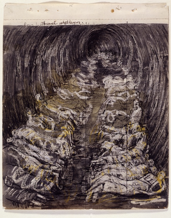
The Hepworth Wakefield’s magnificent exhibition Bill Brandt/Henry Moore compares the two artists’ work over the course of their varied careers and considers the differences of their approaches. It’s a cerebral show, for while the two men did meet (Brandt photographed Moore several times), addressed the same topics (coal miners, the underground during the Blitz, Stonehenge, the human form), and had their work appear in the same publications, the pairing poses more questions than it answers. The exhibition draws heavily on archive material, sketches, maquettes and contact sheets; photography features prominently. At its heart, it encourages viewers to ask questions about process – how artworks get made, how an artist’s thoughts might be traced, what leads a piece to be defined as “art”, and how the circumstances of an artwork’s creation affect its final shape.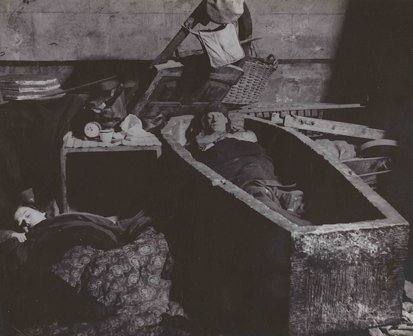 We might compare Brandt’s tumbled sleepers in the Liverpool Street tube tunnels (then still under construction) with the tidier ranks depicted in a sketch by Moore (pictured below). While Brandt captured what was literally in front of his eyes, Moore transmuted the scene into myth, endowing the endless vista with an uncanny timelessness. Are the sleepers physically next to each other, or are they the ranged generations of anonymous civilians affected by war? This question, posed so explicitly in Moore’s drawings, might be extrapolated from Brandt’s photographs; conversely, Brandt’s photographs depict things we might not even imagine given the universality of Moore’s drawings. There’s the Sikh family sheltering in the crypt of an East End church, the orthodox Jewish scholars huddled in study in another crypt, and the Cockney nose-thumb at the traditional memento mori posed by the man nonchalantly asleep in a coffin (pictured above). Lacking knowledge of specifics, it is tempting to project what is familiar onto Moore’s depictions. Imaginative failings of this sort become the first dangerous steps in history being rewritten. But it’s not just Moore’s studies that can be twisted. In another ironic turn, as working-class inhabitants of London who did not have access to their own shelters, the people captured in Brandt’s photographs were the most vulnerable, most overlooked and most ignored – yet they came to stand for London’s resilience and fortitude under intolerable conditions. Their plight became propaganda.
 Part of the problem is that the truth of a photograph, as Susan Sontag pointed out in On Photography, is slippery. Much though they seem to be “pieces” of the world, “miniatures of reality”, for the mere fact that they are selections of time, selections of space, they are inherently misleading. Of course, Sontag admitted that the same holds true for other forms of record. “What is written about a person or an event is frankly an interpretation, as are handmade visual statements, like paintings and drawings.” But her criticism should have been aimed not so much at photography itself as at people’s perceptions of the medium. In the darkroom, day can be made into night and the dynamics between people can be modulated through canny framing. Even before Photoshop, deepfakes and metadata scrubs, Trotsky was being burned out of Lenin’s 1920 speech in Sverdlov Square. The more dangerous aspect of photographs – both then and now – is that because people suppose them to be a direct visual record, they are more swiftly considered more truthful than other forms of account. By prioritising vision above cognition, humans – not photographs – are at fault.
Together, the exhibition and catalogue lay out the ways in which photography should be considered a varied and flexible art form. At the purely visual end, they look at how photographic alterations of the sort made by Brandt were used to more and less legitimate ends. Three prints of people sheltering in the underground at Elephant and Castle show how upping contrast, cropping and burning could quite dramatically alter the atmosphere of a print, to the point of affecting which details were visible. Brandt’s obvious technical prowess at capturing photographs was matched in the darkroom, but it’s worth remembering that his photographic printing technique was, at the time, governed by print technologies.
The rich blacks and luminous greys which suffuse the images with such particular atmospheres were primarily intended to facilitate the “optimal appearance” of the images in illustrated magazines and books. In the catalogue, these kind of alterations are termed “intensification”, but the boundary between documentation and poetry quickly blurs. In reference to his photograph of St Paul’s that was published (in Lilliput, August 1942) under the title London by Moonlight, the show's co-curator Martina Droth notes that “the existence of several similar photographs of St Paul’s, apparently taken during the same photo shoot but in daylight, suggests that Brandt created this nighttime scene in the darkroom.” That he could so manipulate the image introduces an edge of unease into his work. We fear being tricked. A valid fear, for as John Tagg points out in his essay, Brandt was not averse to staging photographs. Since real life does not always depict the issues at hand, his staged photographs of a soot-blackened miner eating his tea at a pristine table, or another mining family eating together with the foreground in disarray should be considered dramatic renderings of truly lived experiences rather than documentary evidence. In this sense, Brandt’s aim was akin to Moore's tunnel sketches – the “symbolical” register.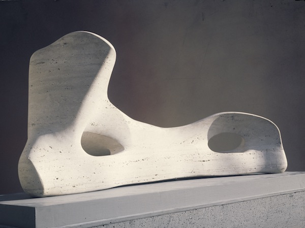 Whether this unmooring from direct representation was legitimate or not, the medium of photography evidently afforded a certain playfulness. Again, here, the uses to which photography can be put run counter to common assumptions. For Moore, who worked at scales ranging from palm-size models to monumental bronzes, photography offered a way of testing, trialling and recording ideas without having to commit more expensive materials or greater exertion to the task. He was a natural magpie, picking inspiration from the world around him – whether a stone, draperies or a shell. "All living forms held sculptural potential in his imagination," writes Droth. What photography offered was the opportunity to swiftly make copies of these raw materials and then assemble them in montages that could themselves be photographed, disassembled and rearranged at will.
In this way, artistic production could keep pace with velocity of thought. As pieces that are both provisional and finished, these photographic montages tracked his progress and recorded the hypotheticals that were cast aside in favour of the strongest ideas. They are works in themselves and, writes Eleanor Clayton, “One of the oddest uses of photography Moore ever made.” It was a method he also used in planning his career-capping 1972 exhibition in Florence. One hundred and sixty-eight works were placed round the city, with Moore paying special attention to the surroundings of each and the vistas they looked out over. As Alex Potts notes of a montage of Reclining Figure set against a vista punctuated by Brunelleschi’s dome, these montages “vividly exemplify the spatial effects he had in mind.” The result, by all accounts, was spectacular.
This brings to mind the fascinating – and underexamined – affinity between photography and sculpture. Volume, and its inverse, space, are the rawest materials with which sculptors work. And though photographed images flatten, photographers inhabit the space in which a photograph is captured, carrying that consciousness with them like a tool kit. After all, they have to consciously set dials on conditions unconsciously calibrated by our bodies – focus distance, light effect, colour temperature. All of these mental mechanisms have to be relearned through the intermediary of a chunk of metal. So it should come as no surprise that Brandt too made sculptures – assemblages of items he collected from the seashore, photographed and sometimes painted. They hang framed in their original Perspex boxes, striking not only for their incursion into the third dimension, but also for their vivid colours.
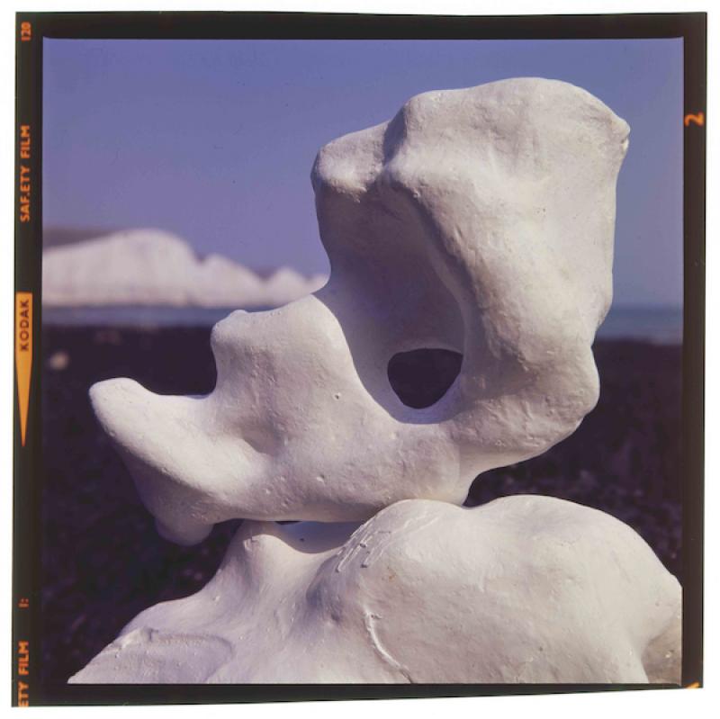
The final rooms of the exhibition which play off this pairing of sculpture and photography are, arguably, the most rewarding. Vitrines holding an array of Moore’s montages and maquettes surround a to-scale, fibreglass working model for Moore’s Standing Figure: Knife Edge. This sculpture, like others, was prompted by a piece of bone. Another vitrine holding a bone, and a plaster and bronze maquette chart Moore’s gradual testing of ideas and materials prior to his commitment to cast Reclining Figure: Bone, 1975 (pictured above). His scrupulous recognition of the possibilities of different scales finds a corollary in a rare and stunning foray by Brandt into colour photography. The transparencies are of stones taken at close range on a beach. Seen close up, they look fluid, fleshy, utterly sensuous and enormous (main picture). Taken together, these stones and bones, sculptures and photographs are a forceful reminder of how differences between artistic mediums matter less than the divergent approaches artists take towards their subjects.
- Bill Brandt/Henry Moore is at The Hepworth Wakefield until Nov 1
- Bill Brandt | Henry Moore, edited by Martina Droth and Paul Messier (Yale University Press, £50)
- Read more visual arts on theartsdesk
@_kwaters_
rating
Share this article
Add comment
The future of Arts Journalism
You can stop theartsdesk.com closing!
We urgently need financing to survive. Our fundraising drive has thus far raised £49,000 but we need to reach £100,000 or we will be forced to close. Please contribute here: https://gofund.me/c3f6033d
And if you can forward this information to anyone who might assist, we’d be grateful.

Subscribe to theartsdesk.com
Thank you for continuing to read our work on theartsdesk.com. For unlimited access to every article in its entirety, including our archive of more than 15,000 pieces, we're asking for £5 per month or £40 per year. We feel it's a very good deal, and hope you do too.
To take a subscription now simply click here.
And if you're looking for that extra gift for a friend or family member, why not treat them to a theartsdesk.com gift subscription?
more Visual arts
 'We are bowled over!' Thank you for your messages of love and support
Much-appreciated words of commendation from readers and the cultural community
 Folkestone Triennial 2025 - landscape, seascape, art lovers' escape
Locally rooted festival brings home many but not all global concerns
 Sir Brian Clarke (1953-2025) - a personal tribute
Remembering an artist with a gift for the transcendent
 Emily Kam Kngwarray, Tate Modern review - glimpses of another world
Pictures that are an affirmation of belonging
 Kiefer / Van Gogh, Royal Academy review - a pairing of opposites
Small scale intensity meets large scale melodrama
 Jenny Saville: The Anatomy of Painting, National Portrait Gallery review - a protégé losing her way
A brilliant painter in search of a worthwhile subject
 Abstract Erotic, Courtauld Gallery review - sculpture that is sensuous, funny and subversive
Testing the boundaries of good taste, and winning
 Edward Burra, Tate Britain review - watercolour made mainstream
Social satire with a nasty bite
 Ithell Colquhoun, Tate Britain review - revelations of a weird and wonderful world
Emanations from the unconscious
 Rachel Jones: Gated Canyons, Dulwich Picture Gallery review - teeth with a real bite
Mouths have never looked so good
 Yoshitomo Nara, Hayward Gallery review - sickeningly cute kids
How to make millions out of kitsch
 Hamad Butt: Apprehensions, Whitechapel Gallery review - cool, calm and potentially lethal
The YBA who didn’t have time to become a household name

Comments
I was fortunate enough to see